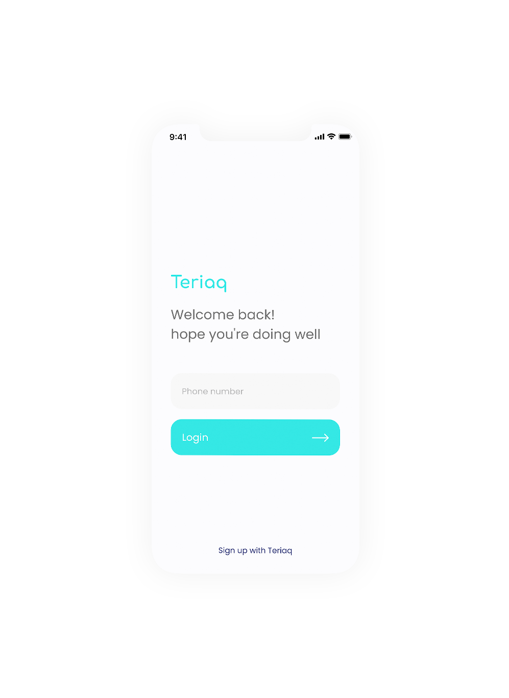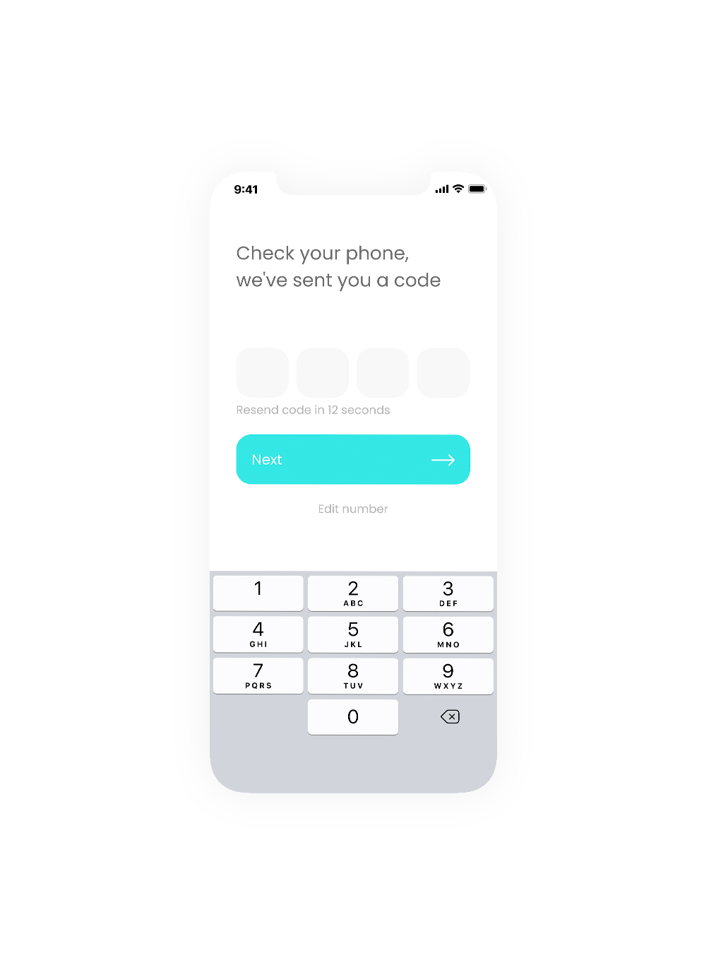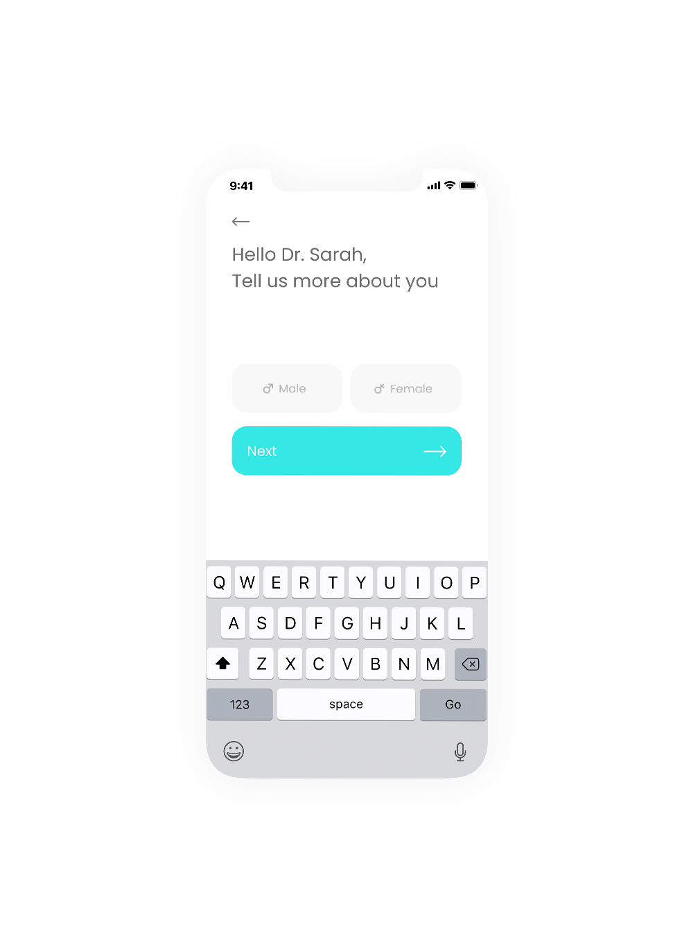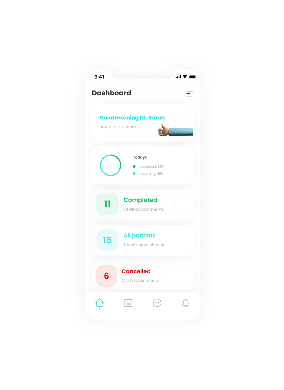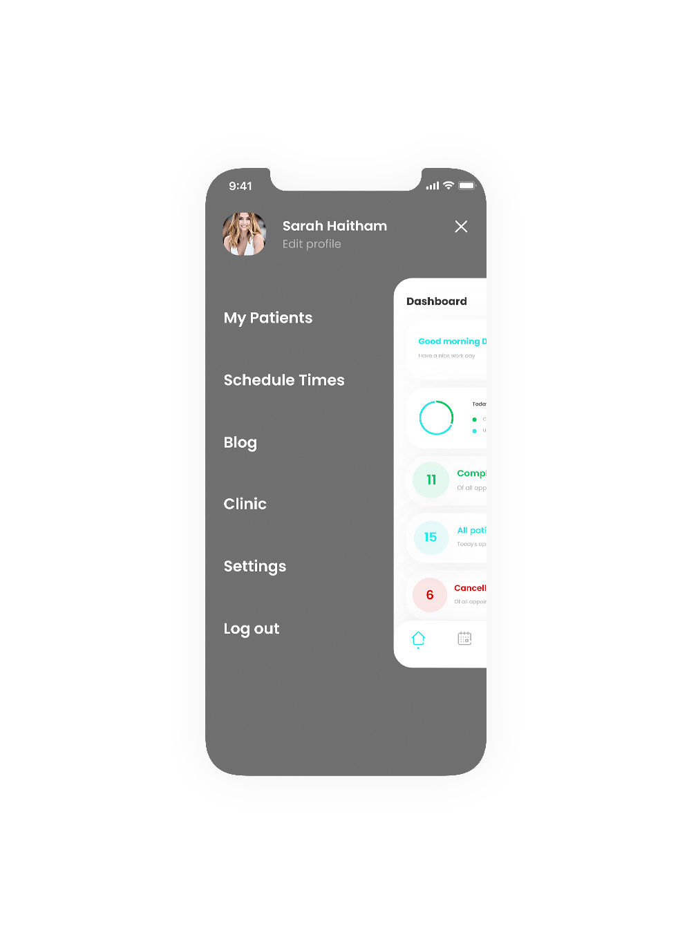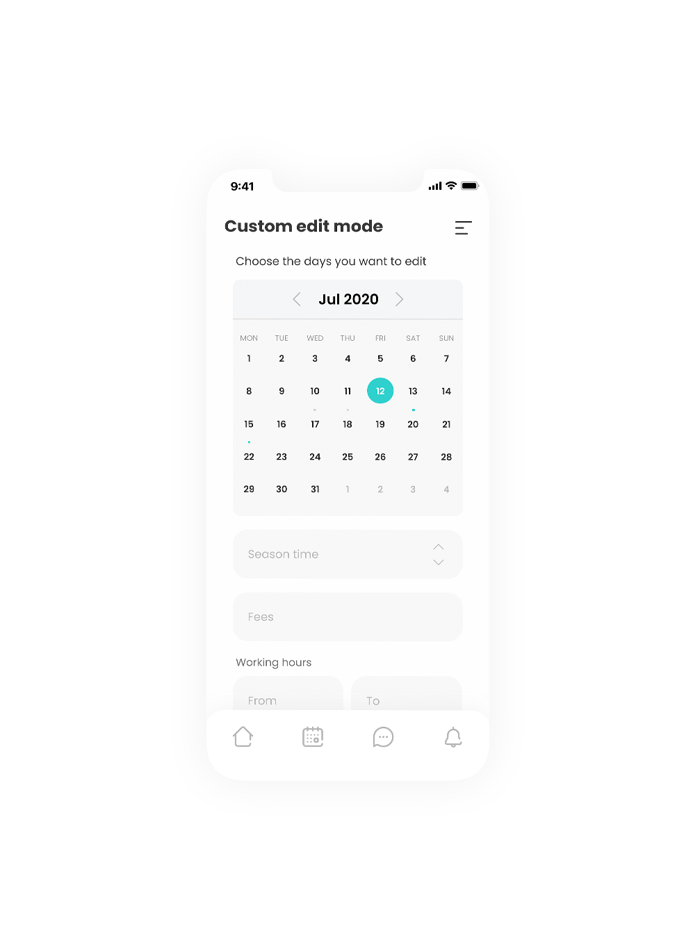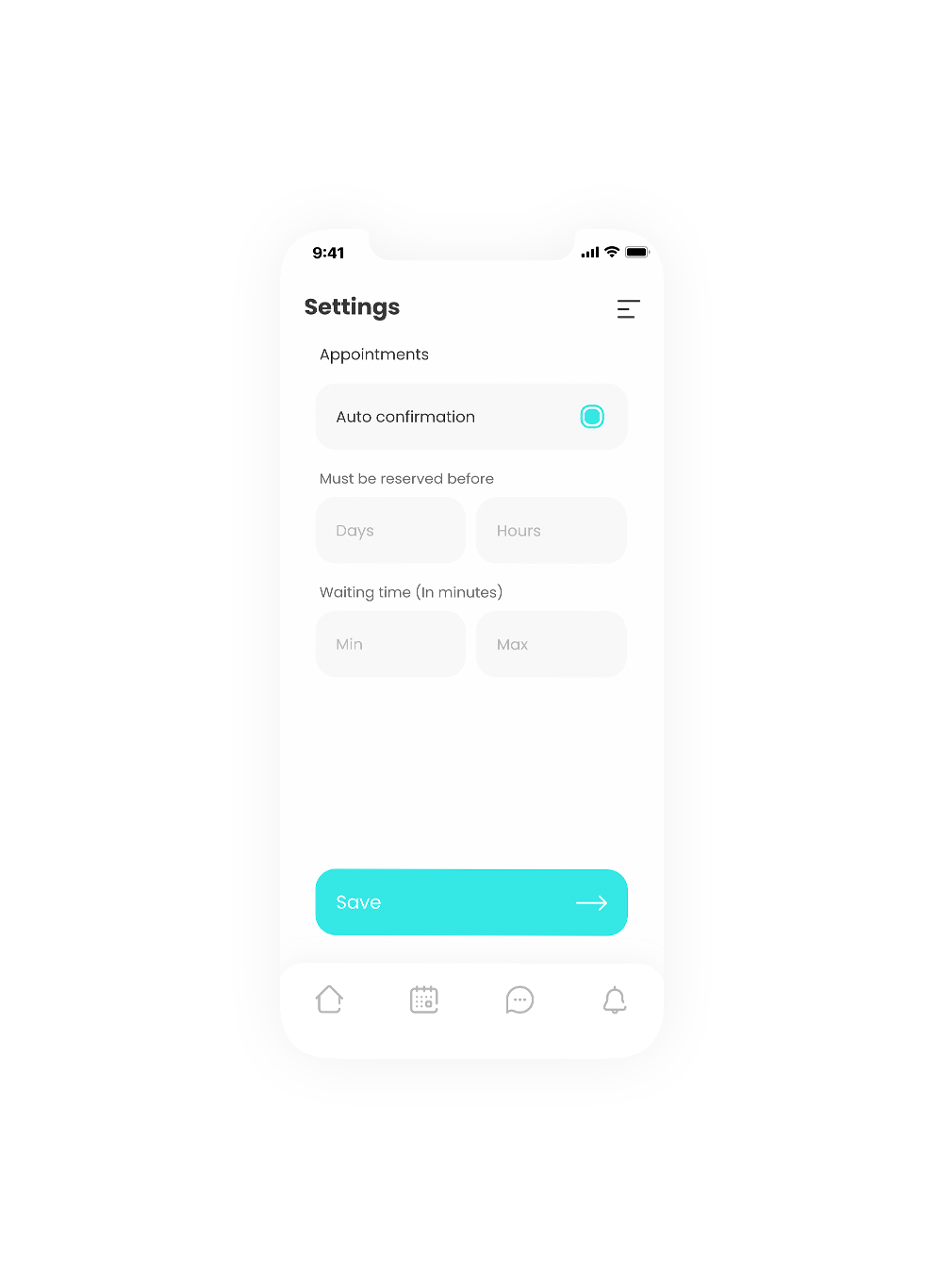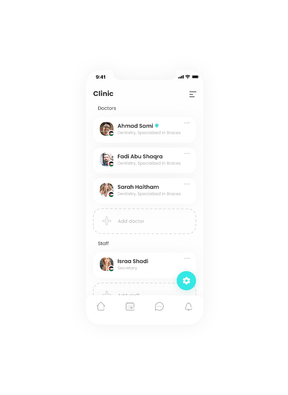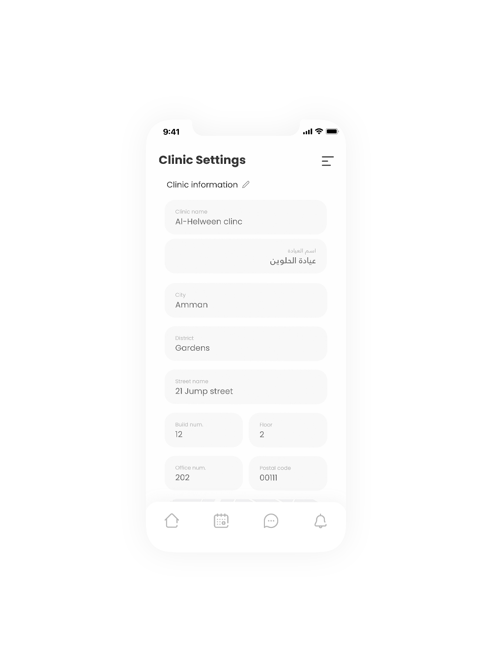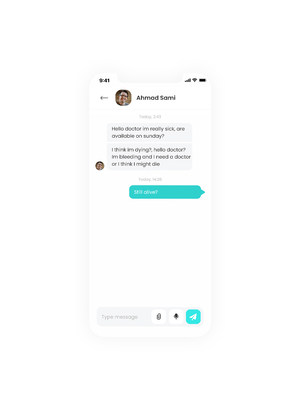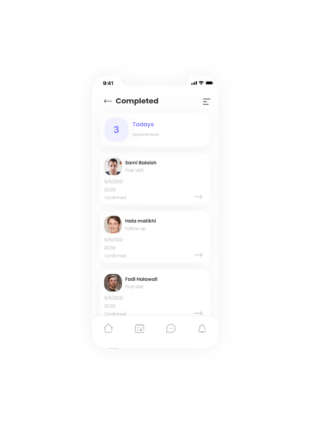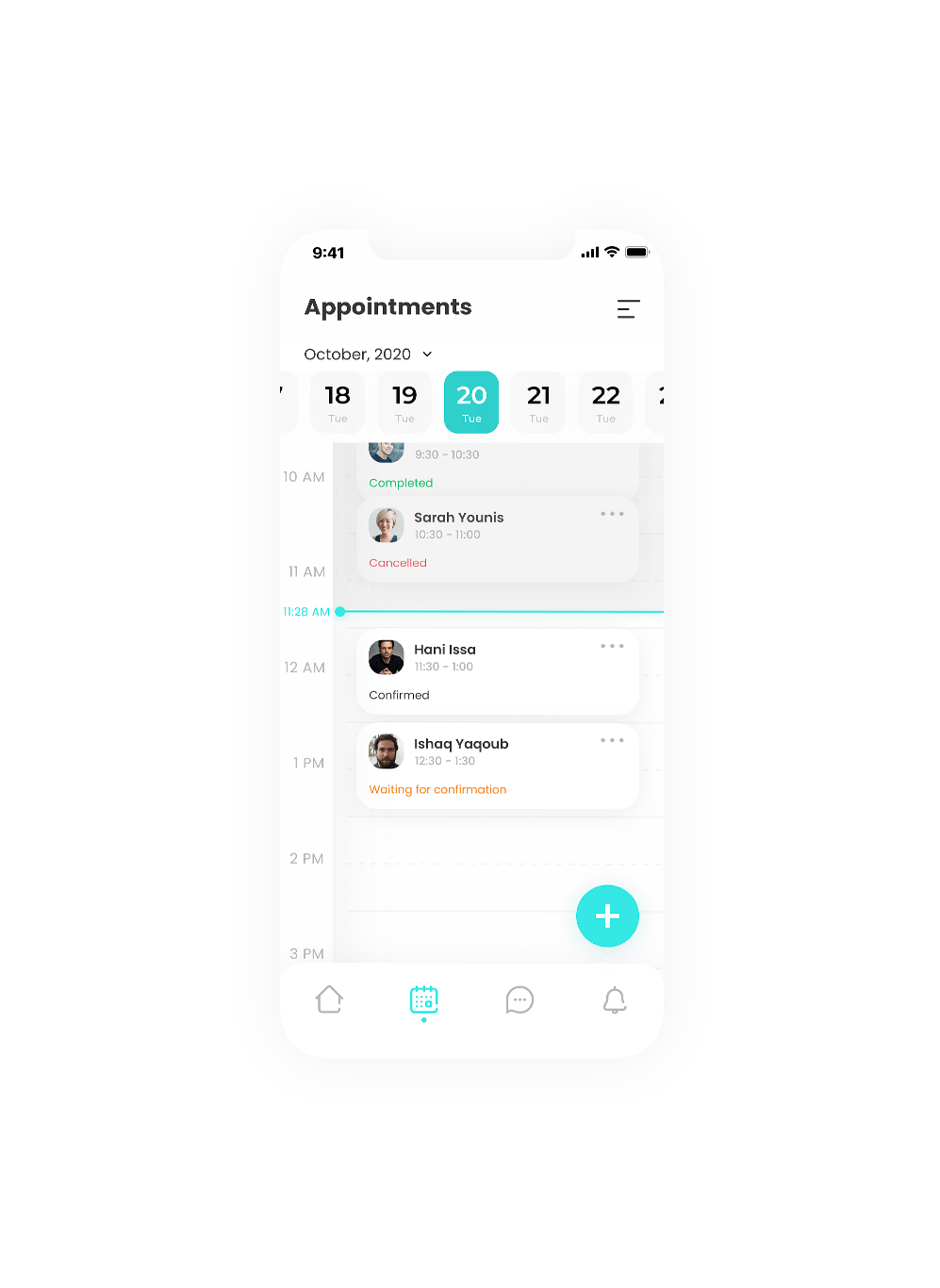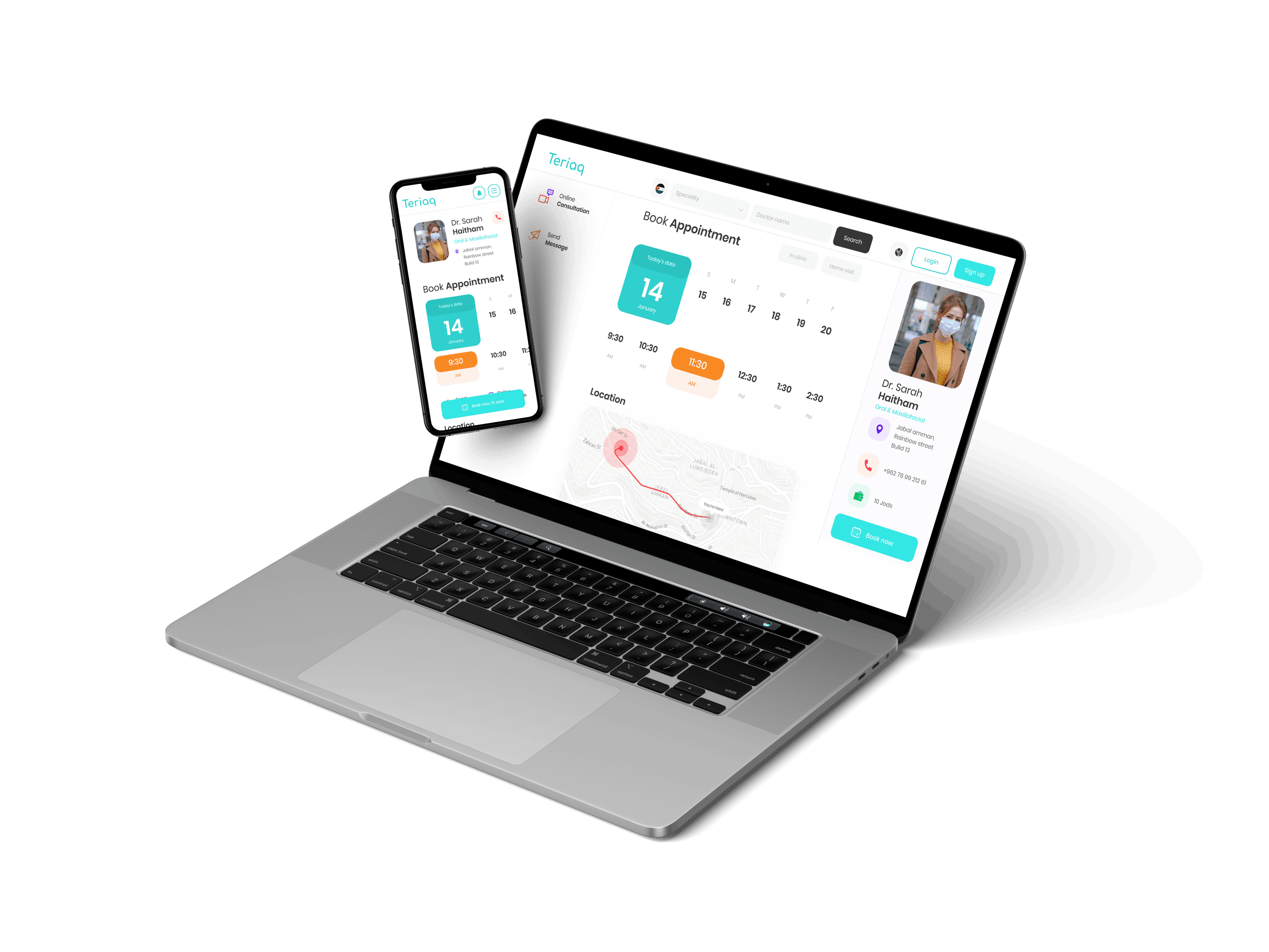

Teriaq is a new online doctor appointment booking based in Amman, Jordan. They want to create an online appointment system that makes it easier to doctors and patients across the country to emphasize the discoverability of doctors so they make them easier to find for those ill people sitting at there homes. And to those doctors fighting the diseases on the front lines.
Teriaq isn't a small project with a normal UX Pattern, Teriaq is alot
more. And after taking a look on there bessiness model, we knew
that we are working on a huge project that's gonna get bigger and bigger by time.
Problem Statement
Jordan¹ contains over 30000 doctors, which amounts to 3 doctors per every 1K people in the country. There are few main doctor appointment systems in Jordan¹ that can function on a large scale. Appointment management, online booking, staff management, appointment tracking, automated scheduling, mobile access.
Most of the appointment systems are un-cared for user experience and lack of usability.
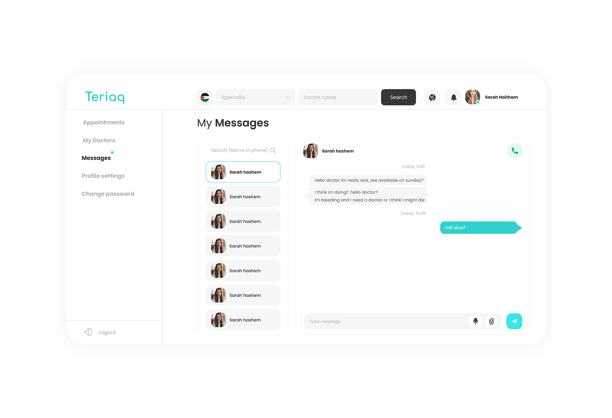
Teriaq wanted to change this. By creating an enchanted user experience and to create a system that works and can develop all over the country for the start, then aiming for regional spread. They wanted to create a platform that allows people to see all the available doctors and to make it much easier to book an appointment, communicate, see reviews and track there appointments.
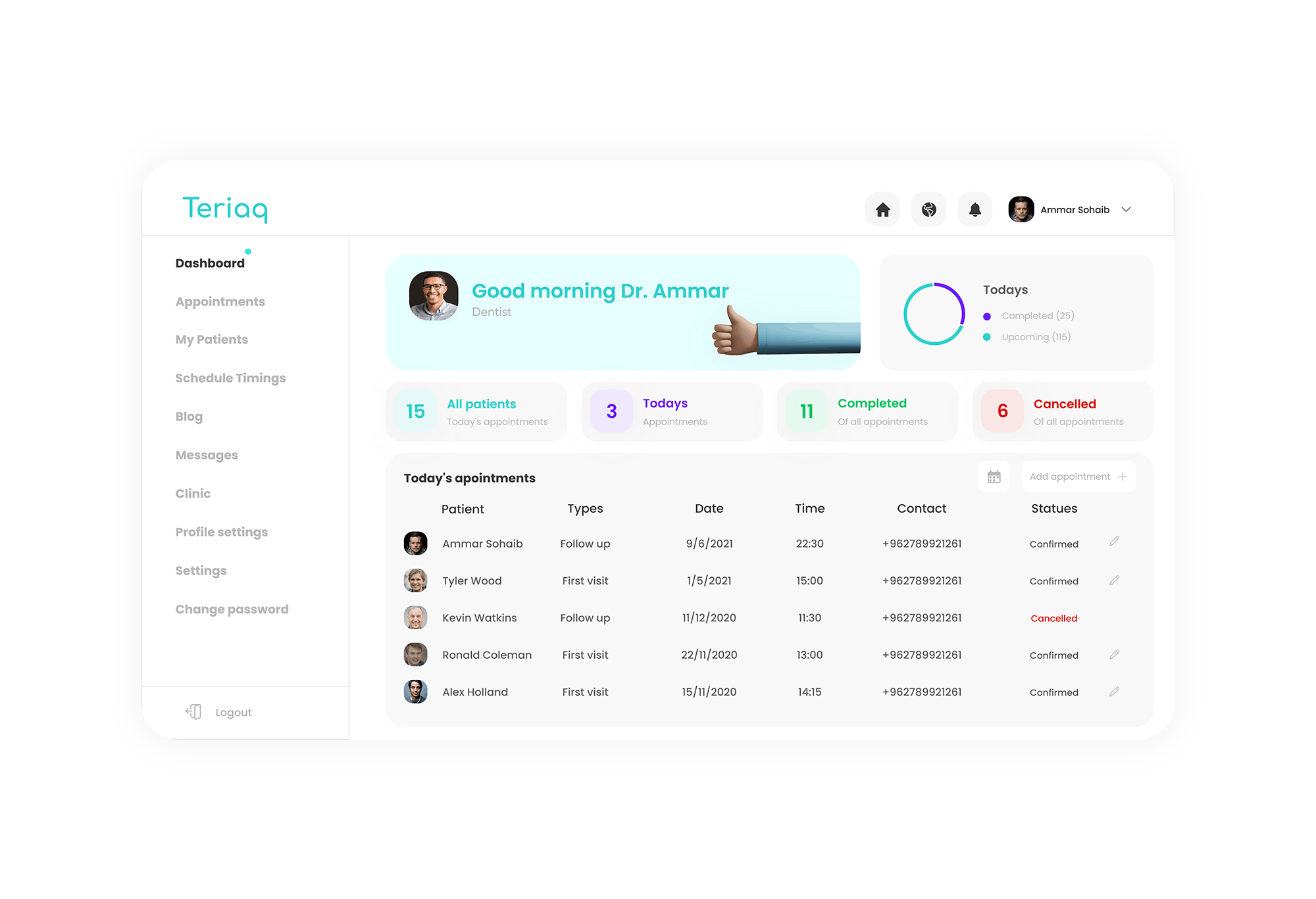
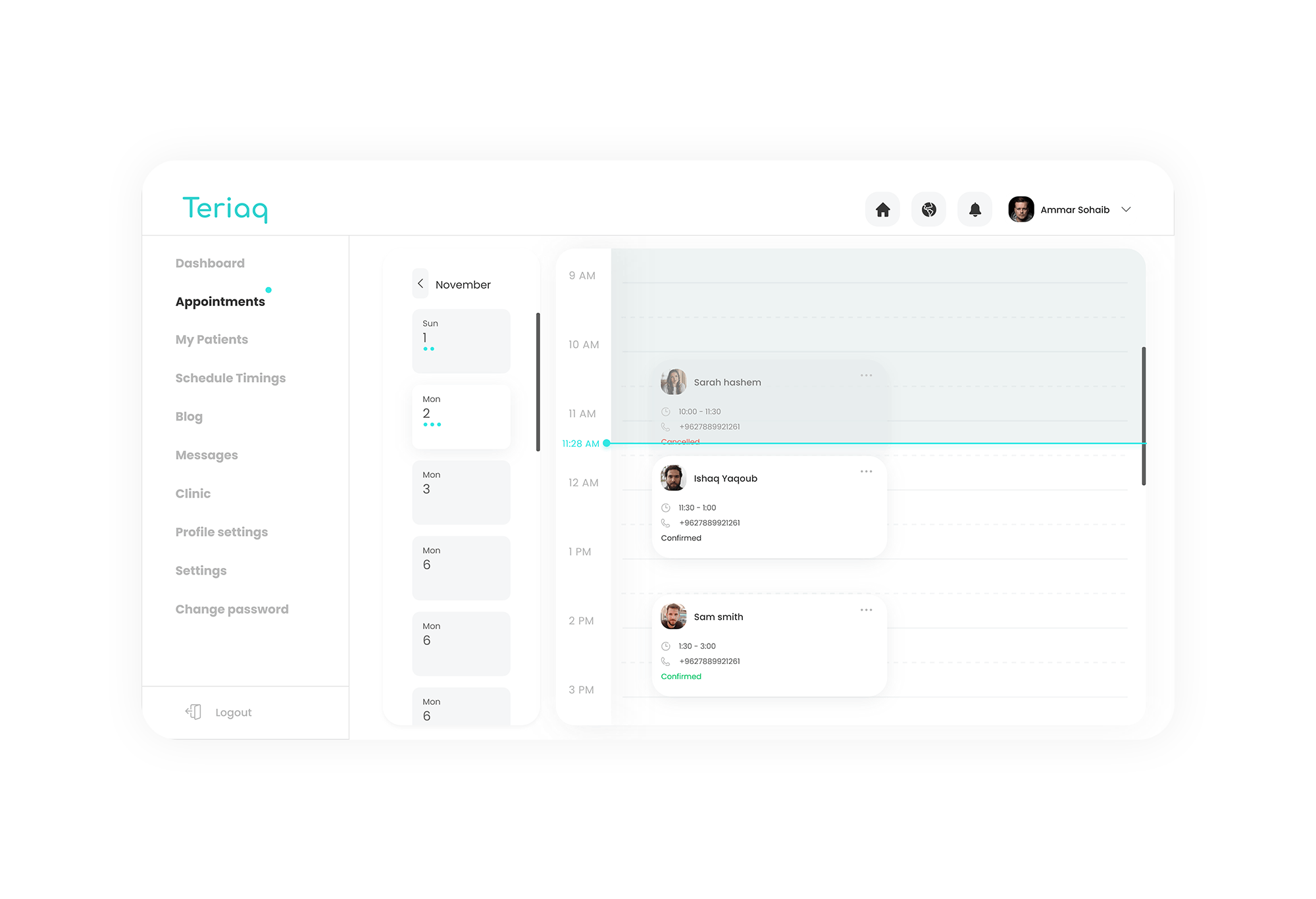
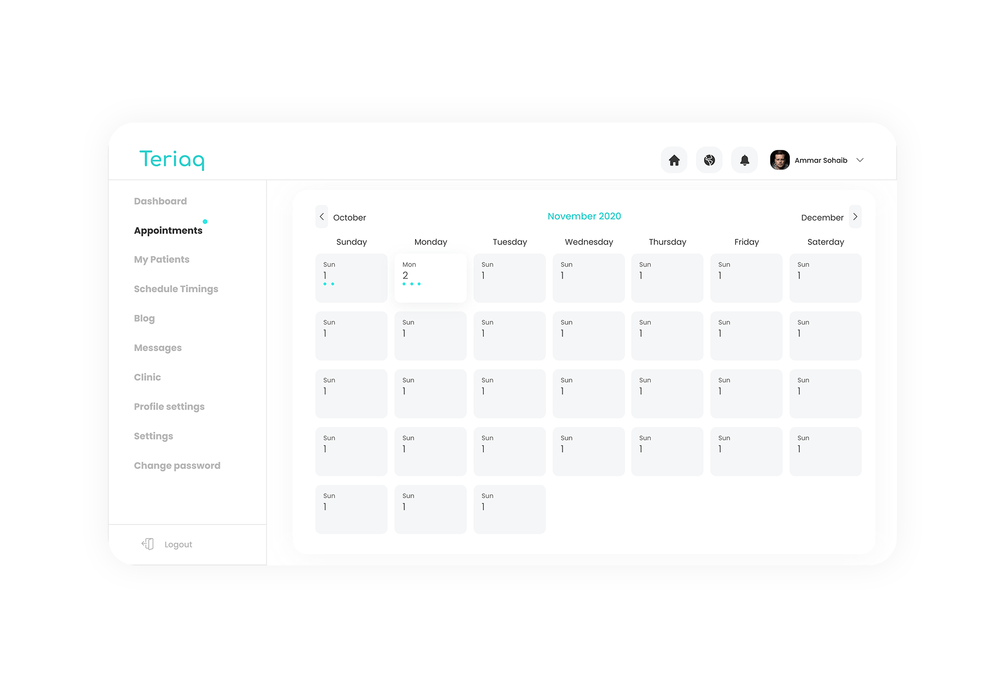
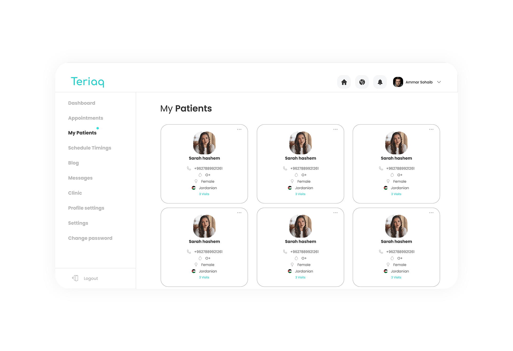
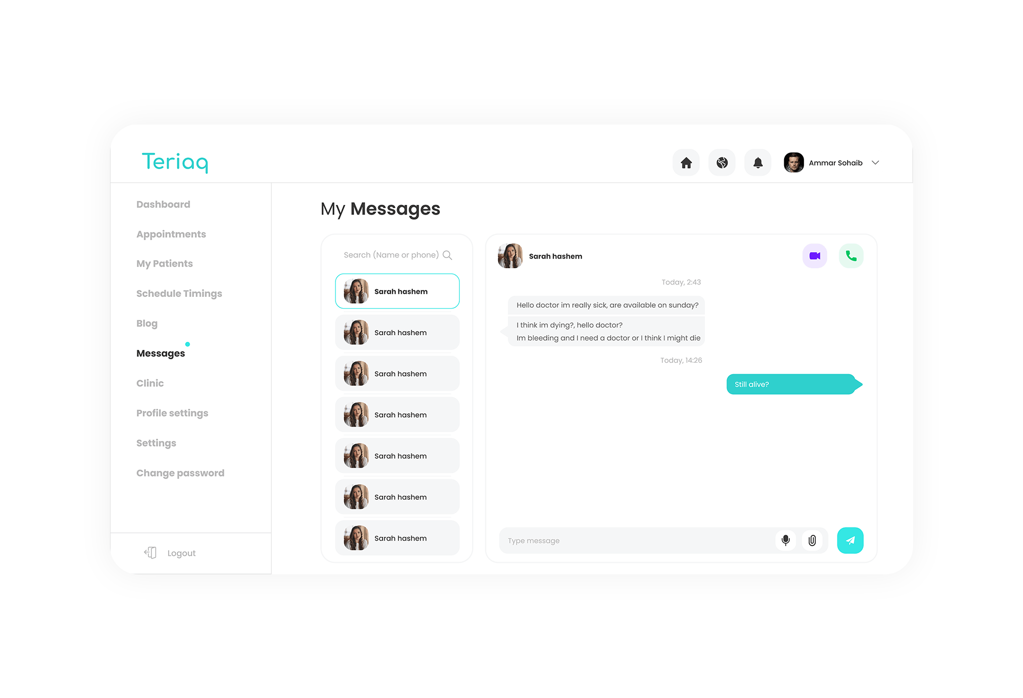
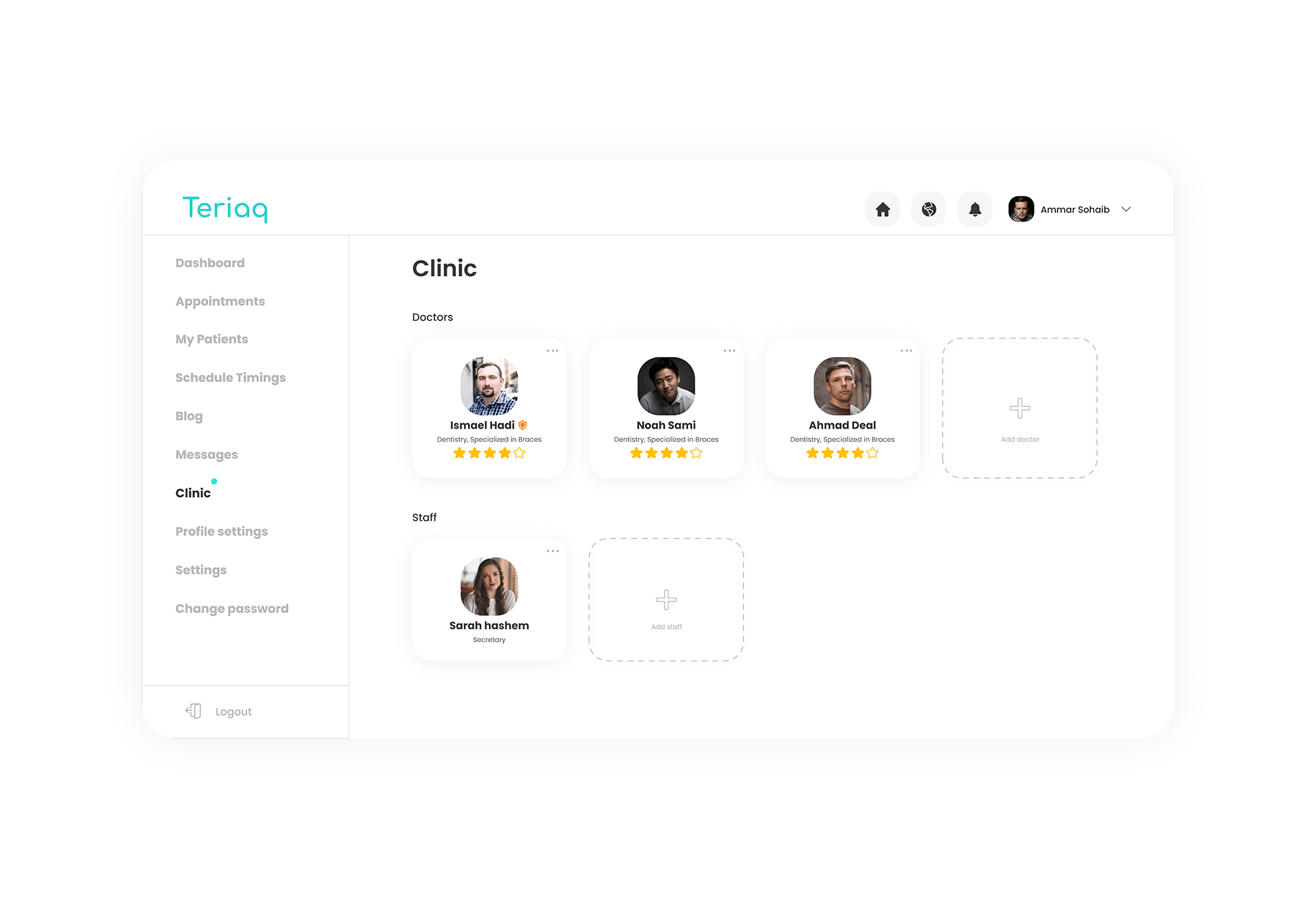
On the other hand, there was the doctor, who also needed a much better experience to manage there appointments, easier access and to track and manage there appointments, patients and messages.
User experience was the primary issue that faced Teriaq to develop a mind blowing, easy to spread in the market platform.
Project Goals
To create a responsive (web, tablet, mobile) website and a mobile application that lets users,
‣ Find and make an appointment with doctor of there choice.
‣ Access information about each doctor that is signed up to Teriaq.
‣ Make an easier workflow and user experience to the doctors and to encourage them to roll-in.
Stage 1 | Research
A research plan was formulated to identify the
doctors, patient goals.
Users pain points.
Using secondary research and attitudinal studies methodology, the mindset of target group, their attitude towards online doctor appointment booking and searching were analyzed.
Survey Findings
Conducting a user survey for understanding people's perception towards online doctor appointment booking helped uncover notions surrounding the user mindsets to online appointment booking. Some of the notable inferences from the survey are listed below:

Hindrances to online booking
There are a lot of people who come to Jordan yearly for it having a wide and a professional health services²
But on the native scale, people don't trust online booking systems It is largely because of the assumption that online booking systems aren't effective and always require some human based communication to confirm the appointment, which make the trust in the system even lower and the possibility of booking with no showing in the clinic. Some of the other inferences from interviews include -

Overall research findings helped establish necessities for the website
- Doctor appointment systems needs more care for user experience awareness. Dark patterns were used fairy in the website to insure that users are good.
- Entire doctor appointment journey needs to be streamlined digitally to increase chances and number of efficient and successful appointments booking.
- The platform should emphasize the trust between the user and the system.
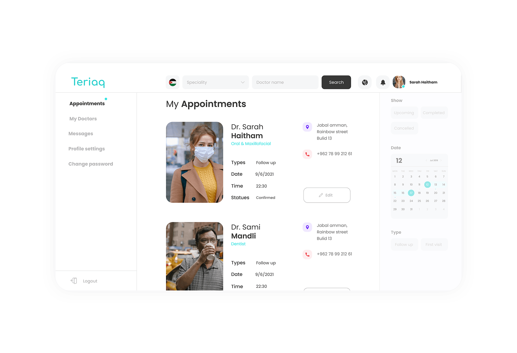
- Users need to be up-to-date with there appointments and to track the statues of them easily.
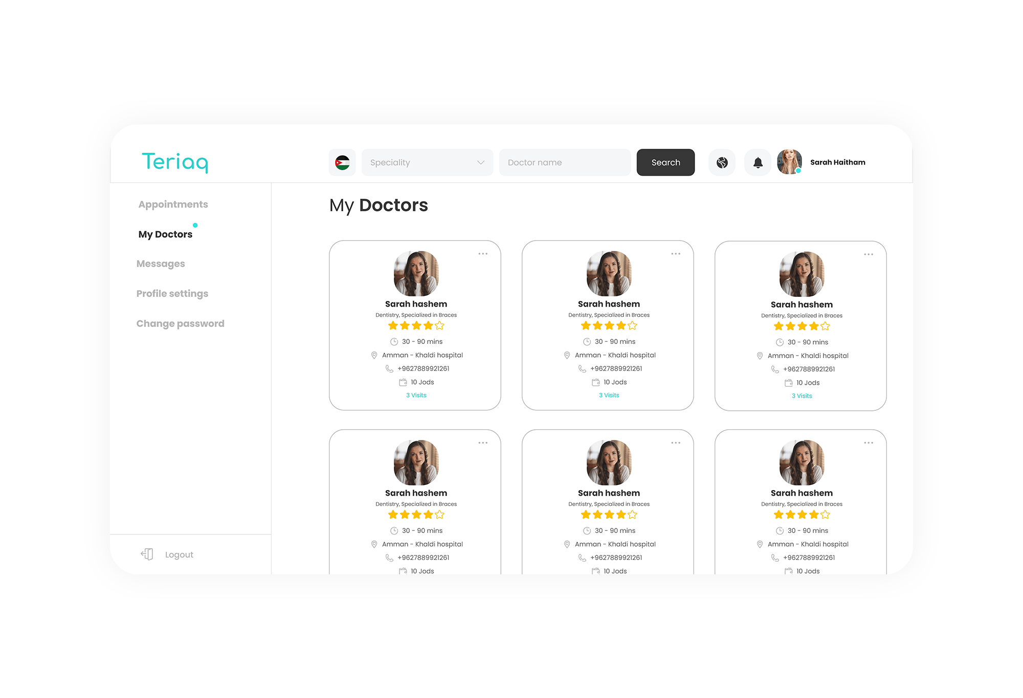
- People care alot about the reviews and other patients experiences with the doctor.
Stage 2 | Defining the problem
Synthesizing User Research
User persona / Empathy map
From the research findings, participants inputs from contextual inquiry, research data was analyzed to identify similarities/patterns behavior and preference. Based on the opinions and views shared by participants from user survey and interviews, a persona was created that encompassed their shared ideologies. Following which an empathy map was developed using patterns observed from inputs provided by participants from contextual inquiry.
Product Roadmap
After a thorough investigation from secondary research and user interview findings, Teriaq features in the website were established by creating a product feature roadmap, keeping the scope between appointment booking , appointment management and doctor/patient management .
Information Architecture
Using the features furnished in Product Feature Roadmap, a sitemap was created combining the task flows with user navigation paths for the three major task flows,
-booking an appointment with the doctor.
- Reading reviews and doctors biography.
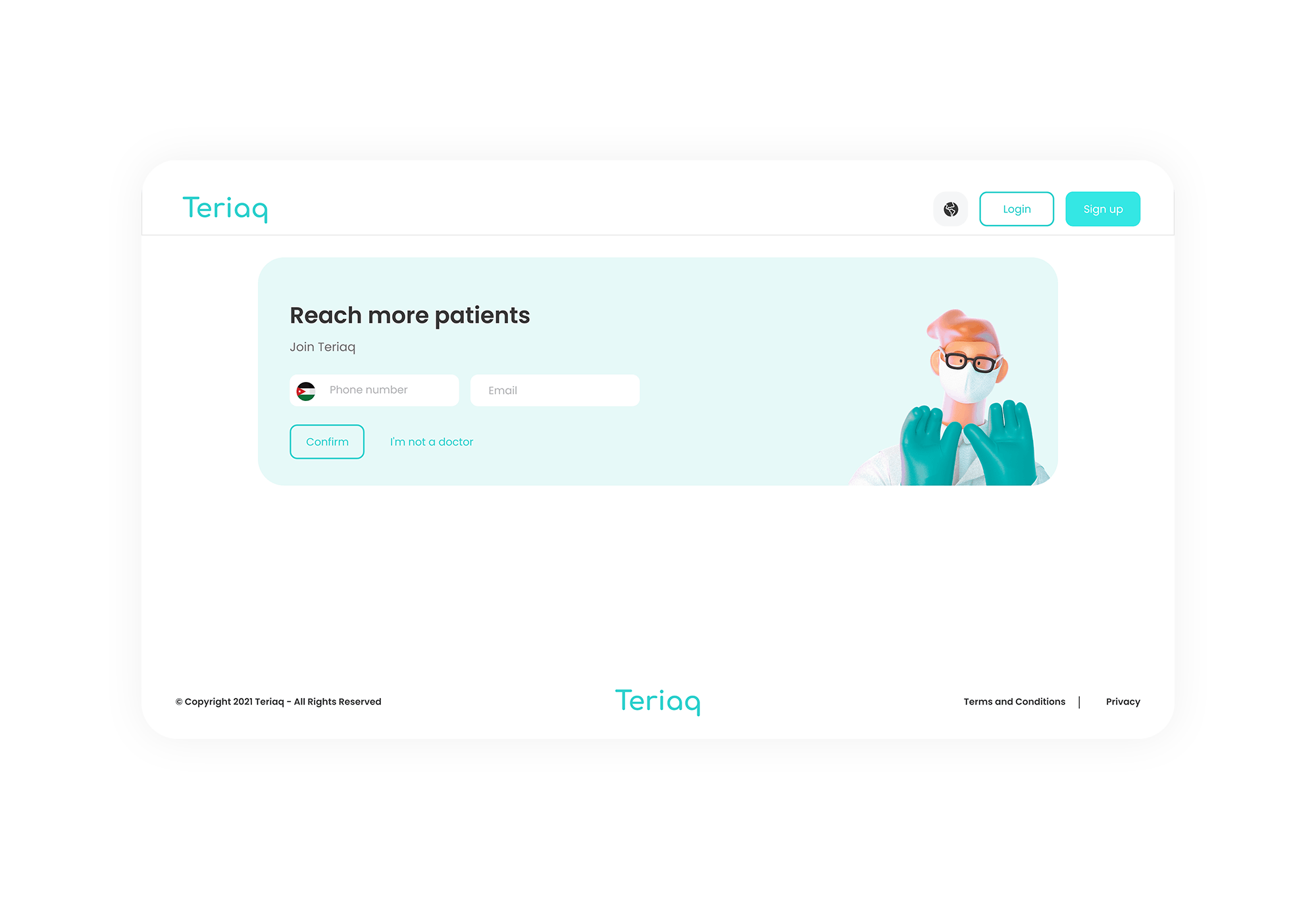
- Making patients and doctors to sign up so they can use all the benefits of the system.
Stage 3 | Ideate and Design
Wireframes
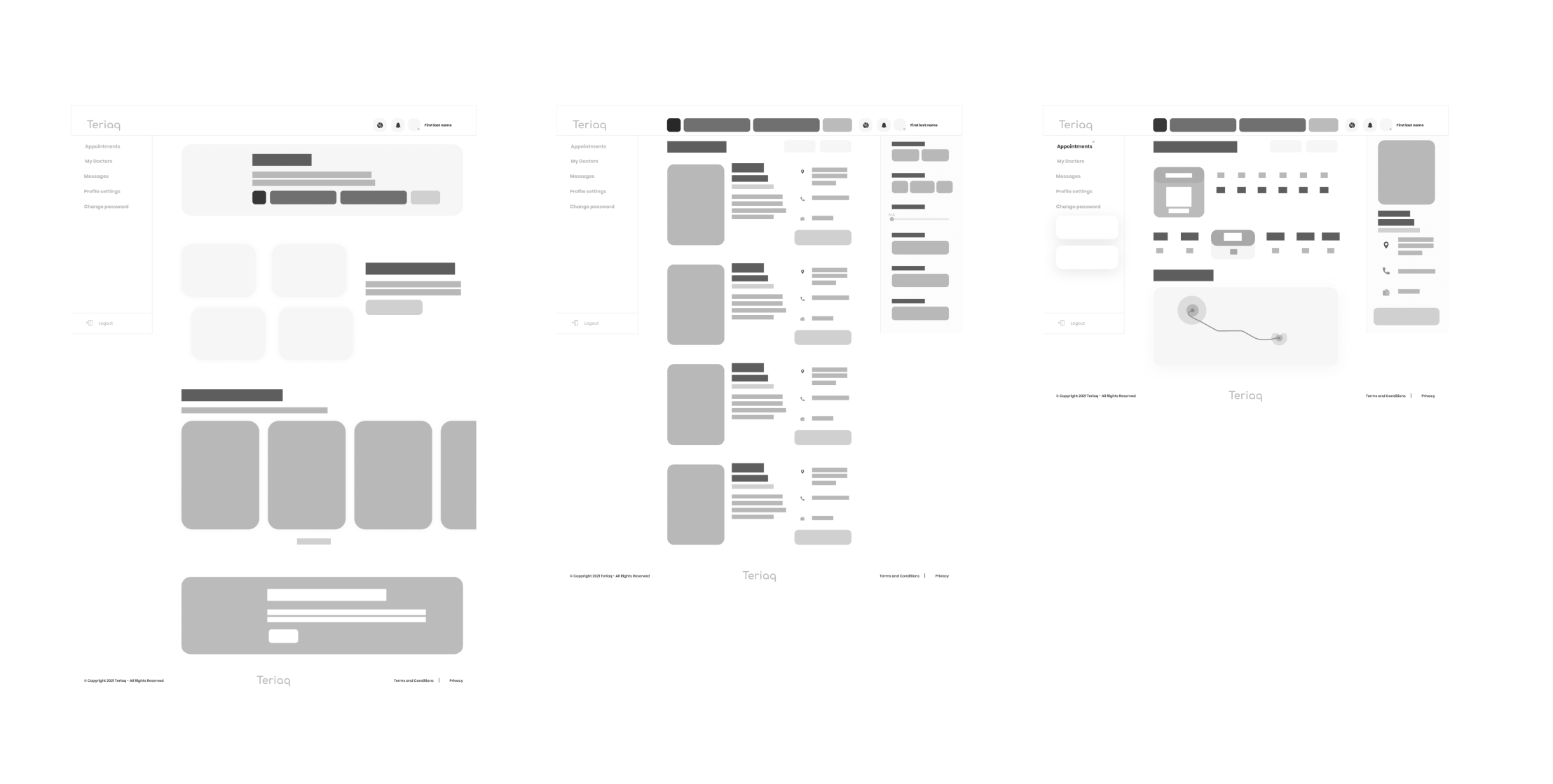
Initially sketches were made to build variations on the homepage design to establish a basic structure of the layout for web, tablet and mobile version. We only made it for the main flow to the appointment making to get the main structure.
Brand Identity
A logo that helps the platform to develop on large scales as they planned about the brand was designed. The logo symbolizes simplicity and minimal modern message. With an indirect message that all the experience here was simple and modern - which is to provide more trust in our system. The letter " i " of the logo also minimally represents a 'human', which is to represent the importance of the humans in our system and that it all goes to take care of the human health and community.

UI Guides
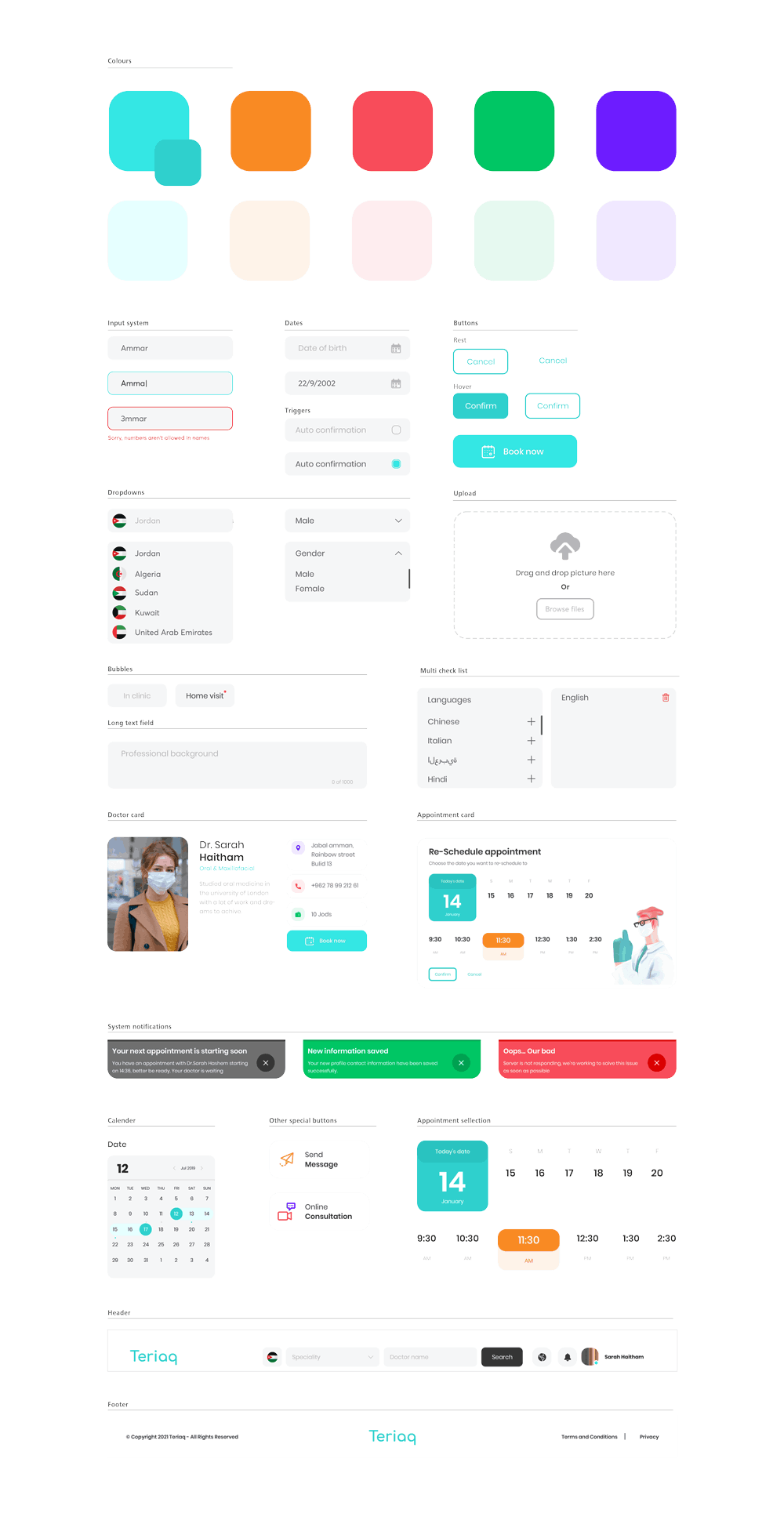
Since Teriaq is a business with an enterprise plan, we made it easier on their developers to stay guided along the journey and not to somehow design something out of the crowd. The UI Guides helped them alot to understand how the components work and where and when to use them.
Stage 4 | Prototype & Testing
Prototyping
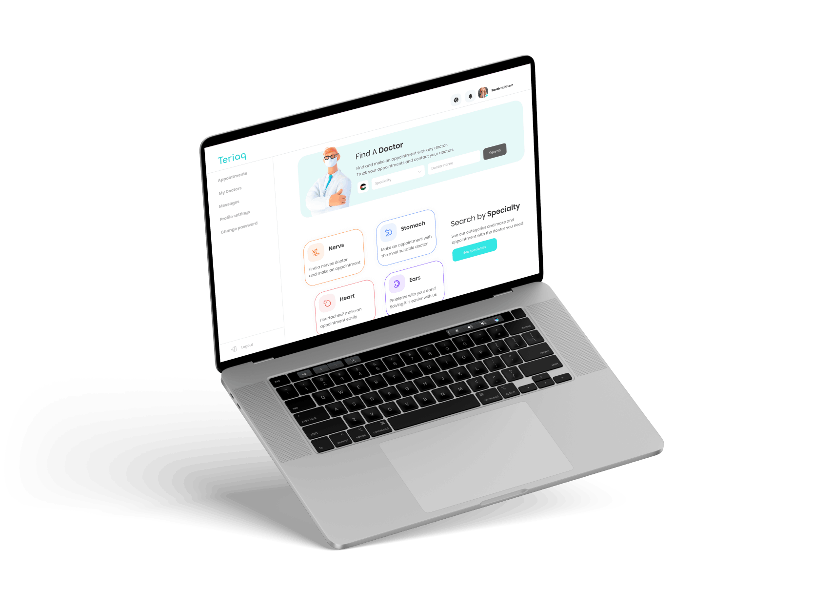
An interactive high fidelity prototype of Teriaq desktop website was created using XD. The prototype functionality is a high fidelity full prototype to use and to test and the system functions. And we made sure to create every single detail perfectly to match our major flows.
- Booking an appointment with the doctor.
- Reading reviews and doctors biography.
- Making patients and doctors to sign up so they can use all the benefits of the system.
Try the web prototype here:
Usability Testing
To determine the level of efficiency of design and usability within the user interface of the interactive prototype, moderated usability testing was conducted. The test was designed to establish ease of navigation within task flows, get clarity in content and call-to-action based on user understanding, identify any anomalies in navigation, terminology ambiguities etc. Post observation feedback was gained from the test participants to find what they liked the most, liked the least and their recommendations for improvement.
An affinity map and a heatmap was created based on errors and issues observed during usability testing. The affinity map is segregated into groups of findings in navigation & usability; content and call to action, suggestions from participants and recommended course of action to address the issues. The prototype was further updated to accommodate the changes rolled out in affinity map.
Way forward
Given the time and effort I invested in this project, the overall outcome has been quite successful. If I had more time I would definitely like to work on designing the other sections of the next phases of this enormous project
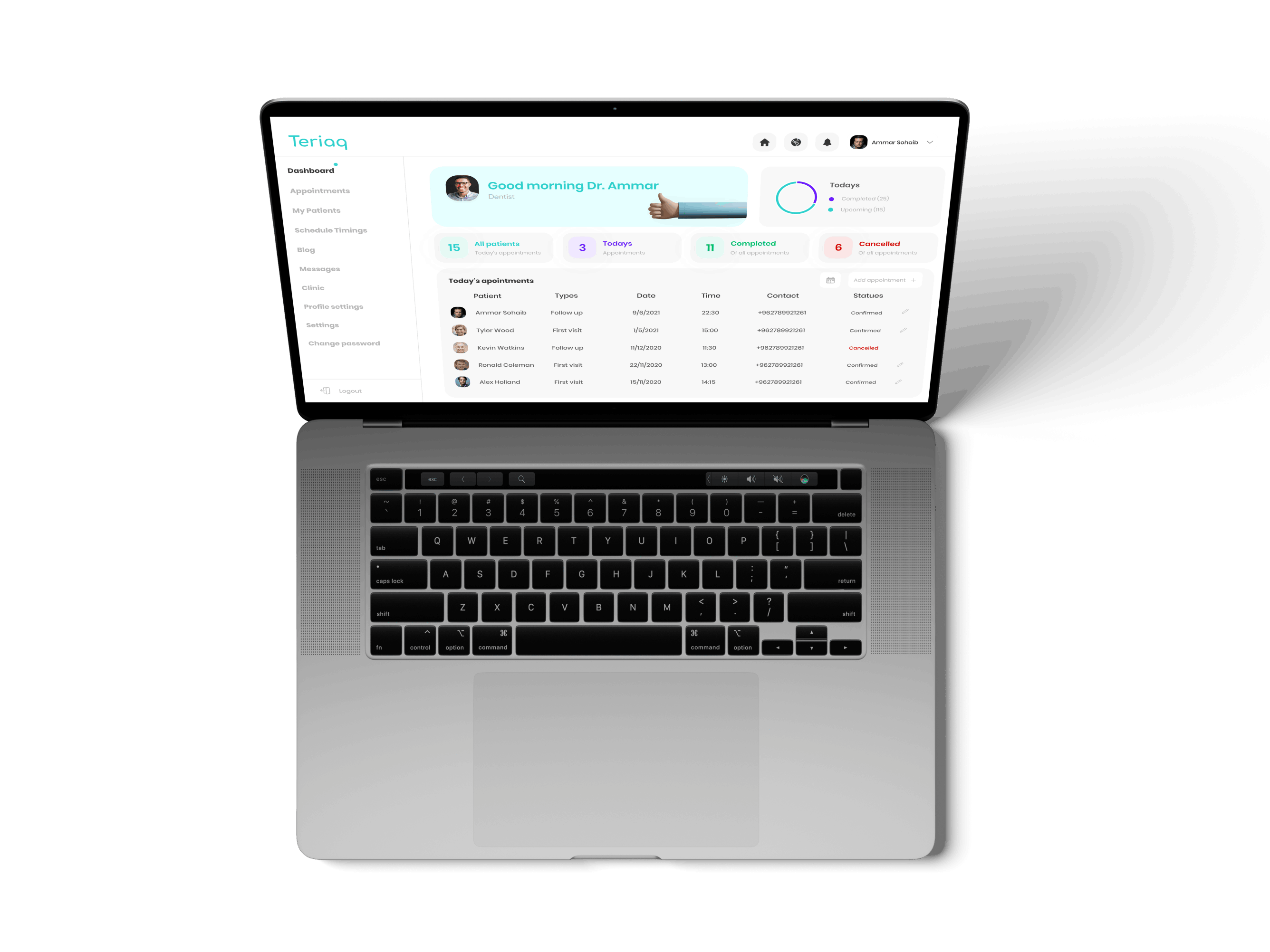
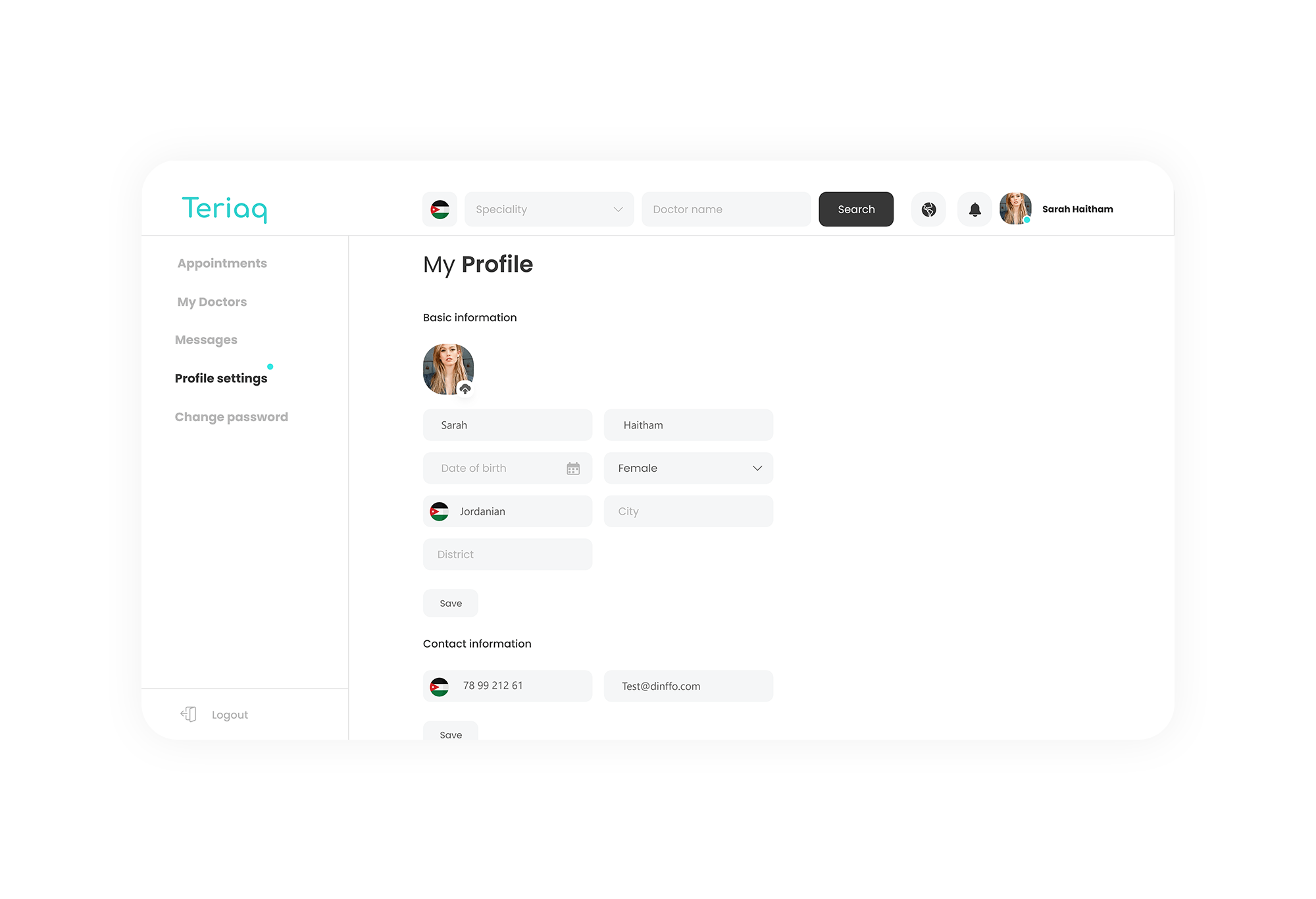
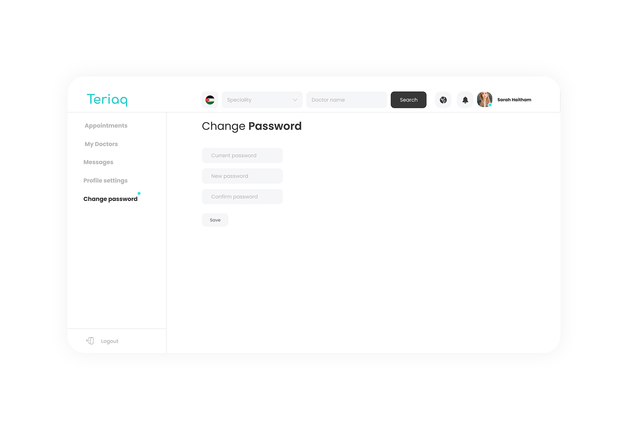
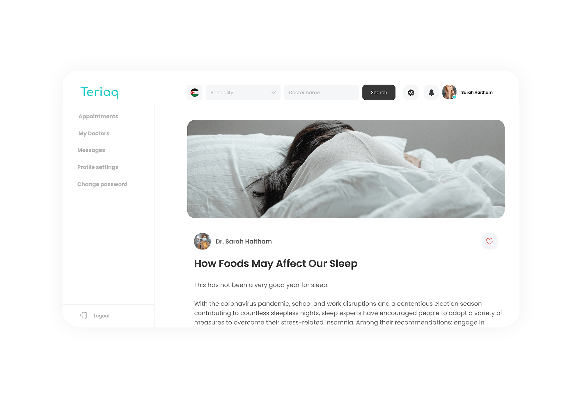
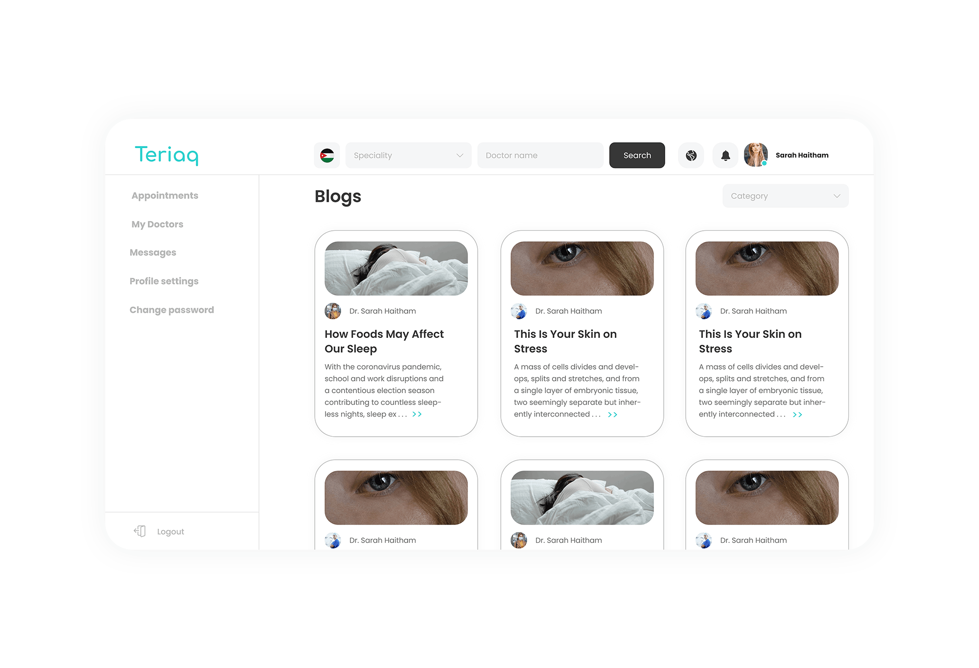
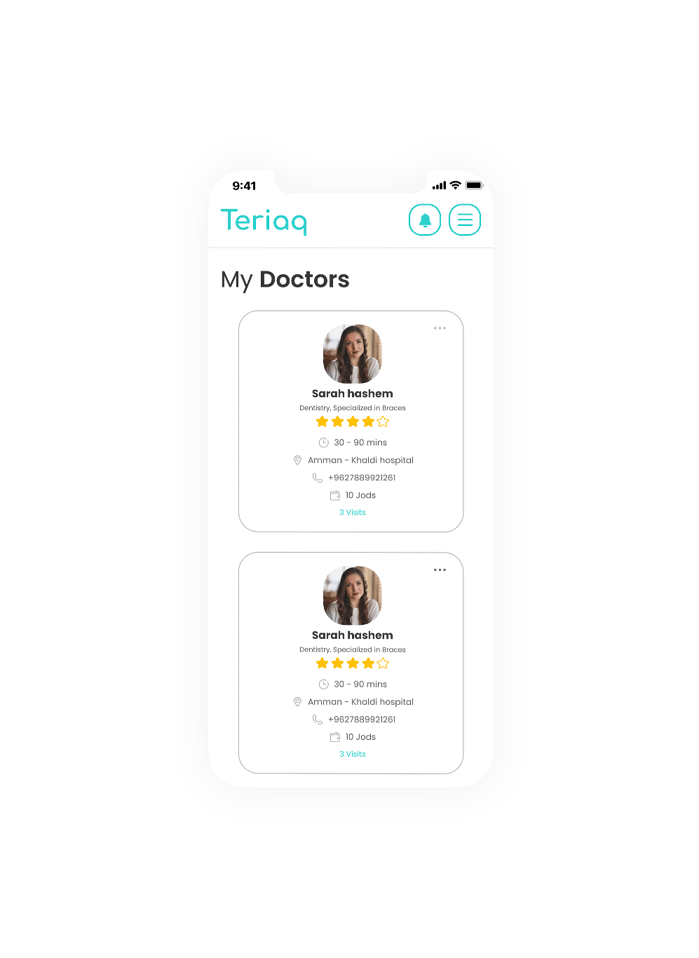
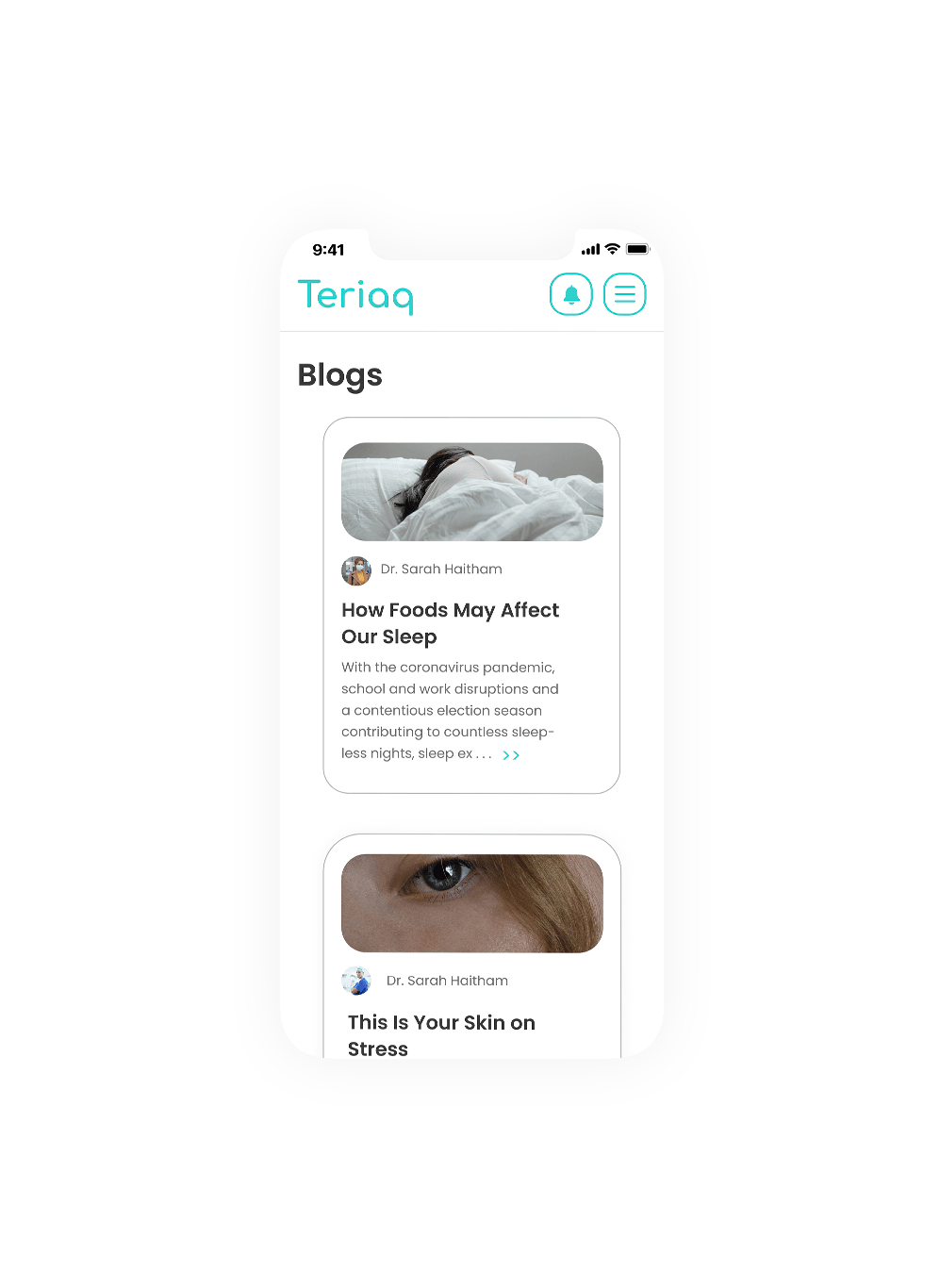
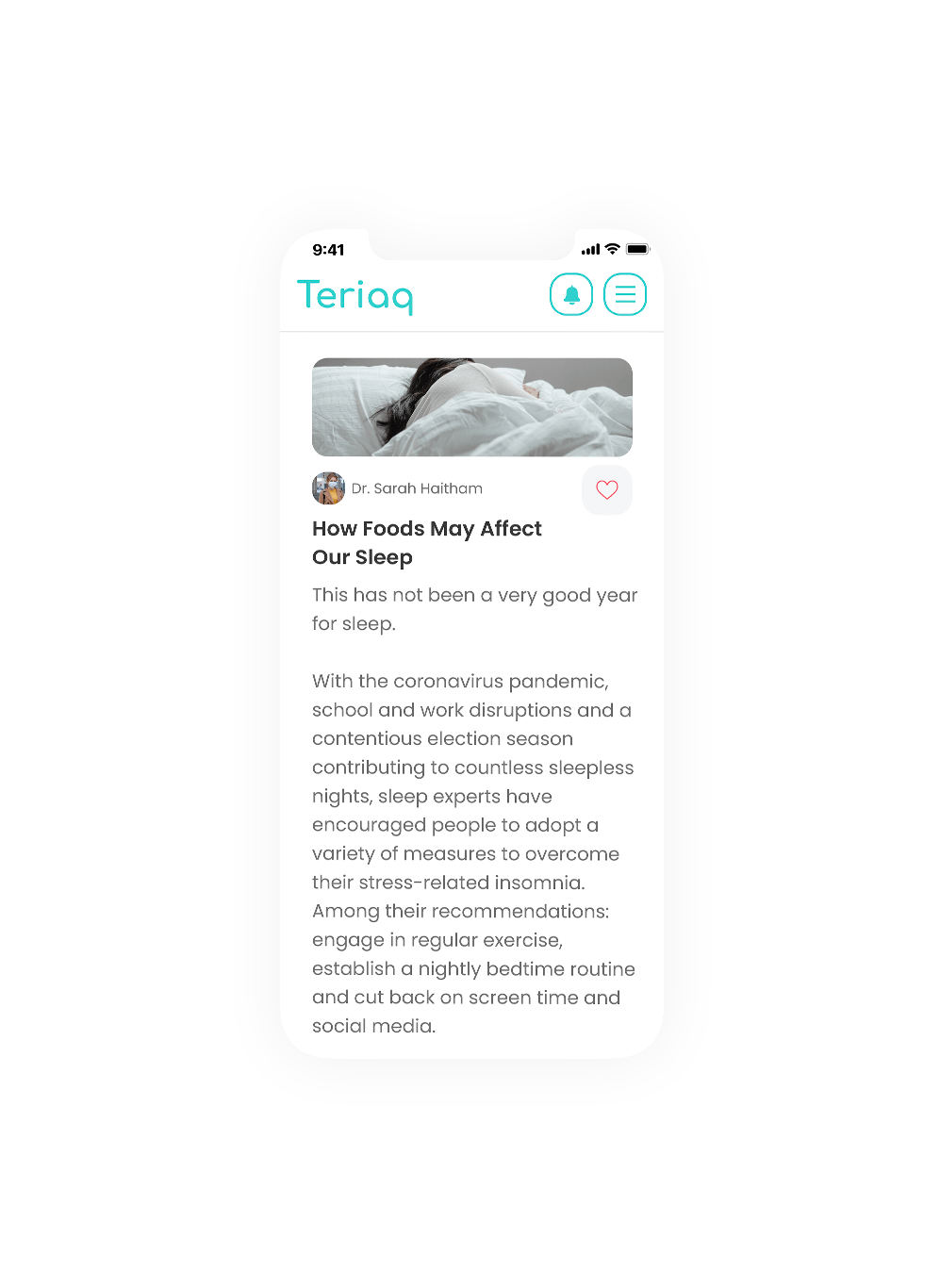
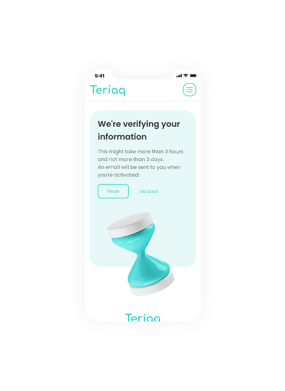
We made effort to make sure the platform looks simple, modern and smooth.
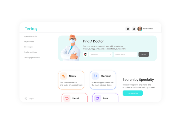
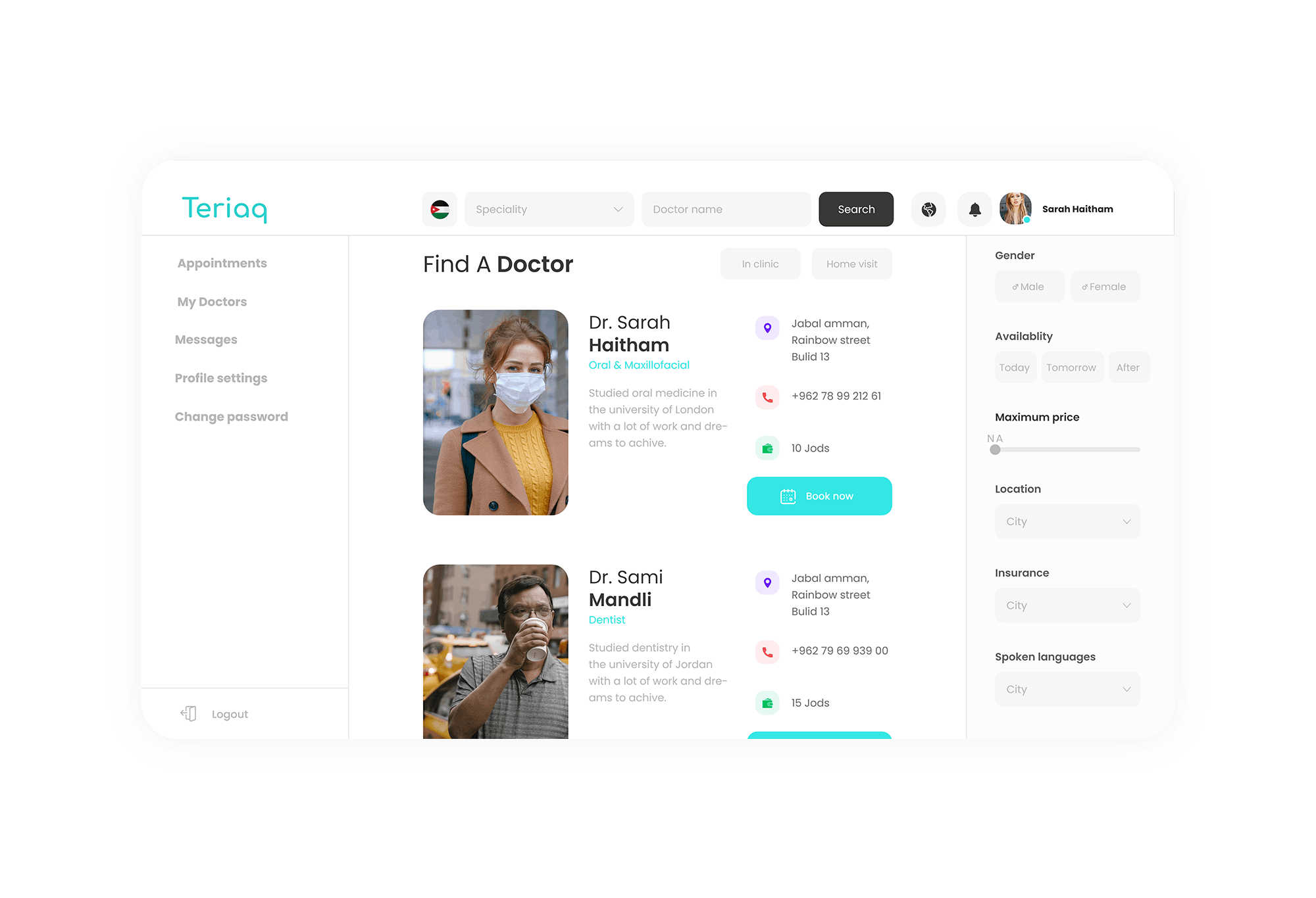
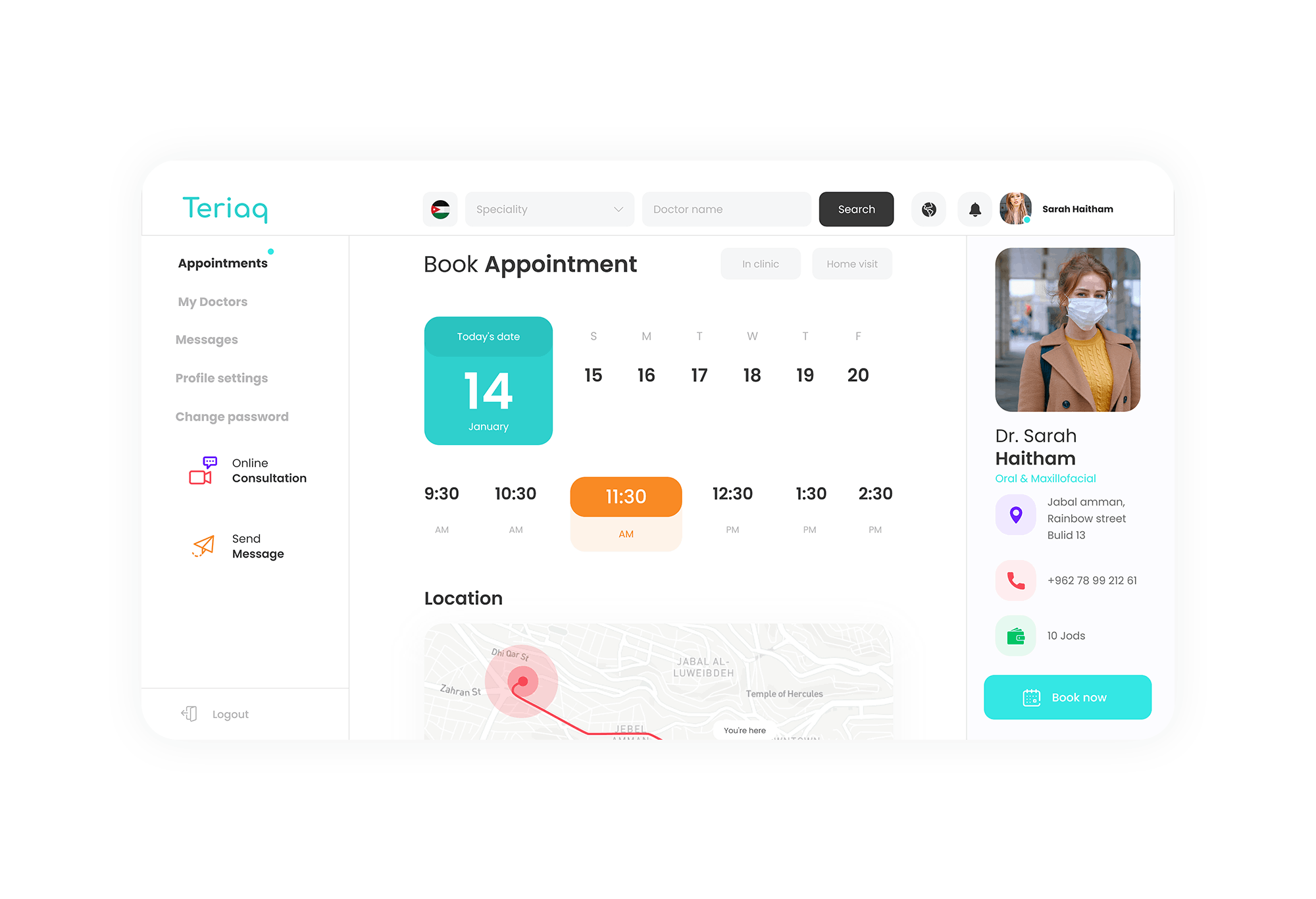
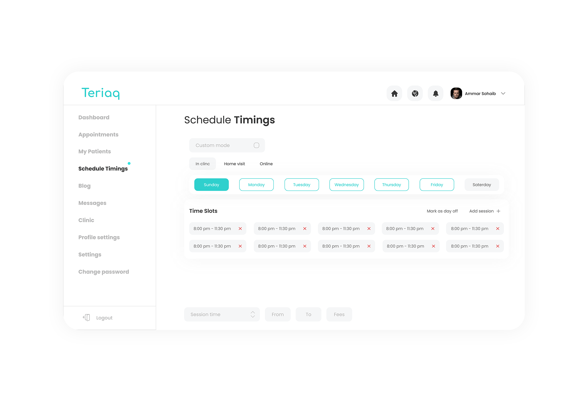
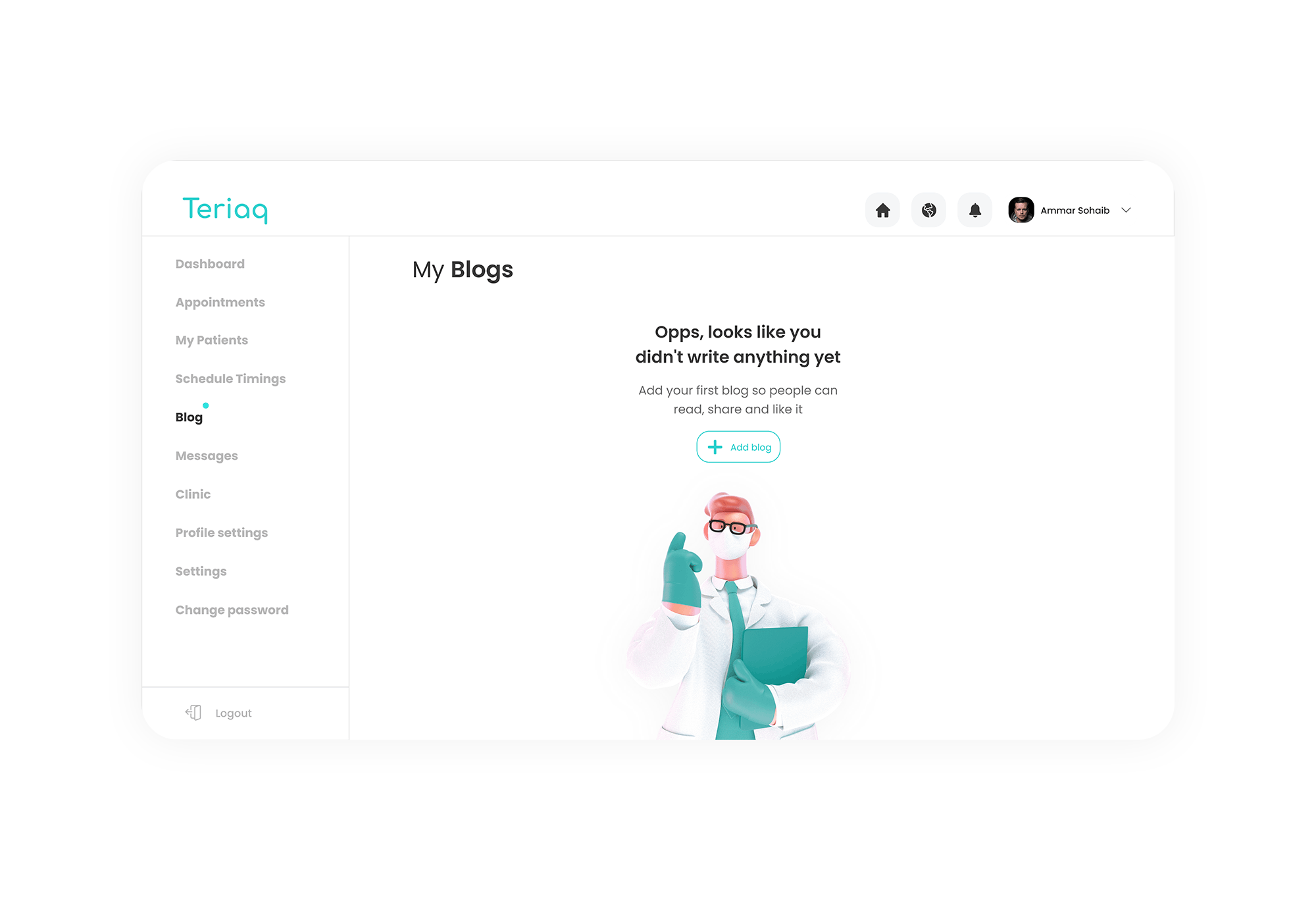
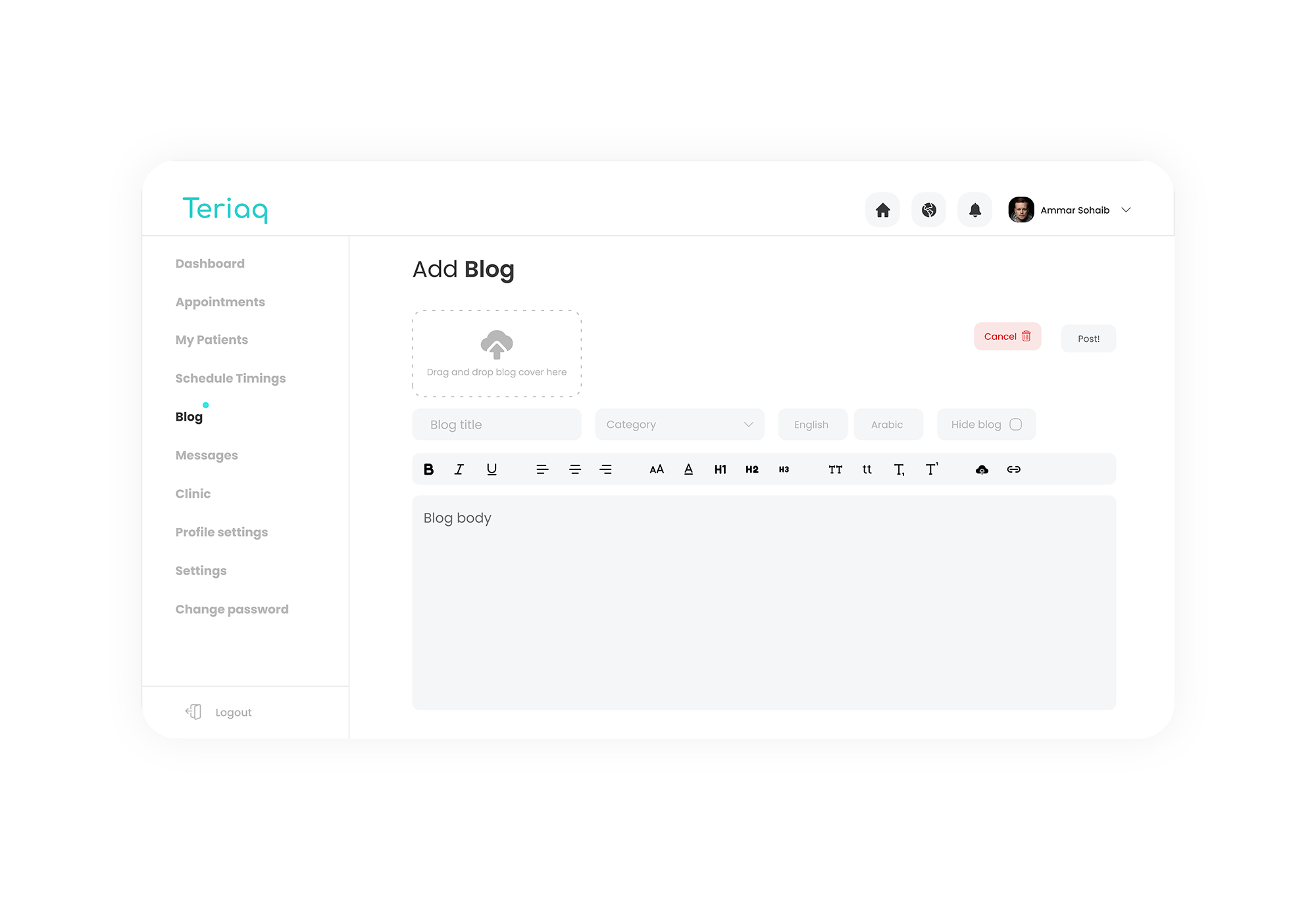
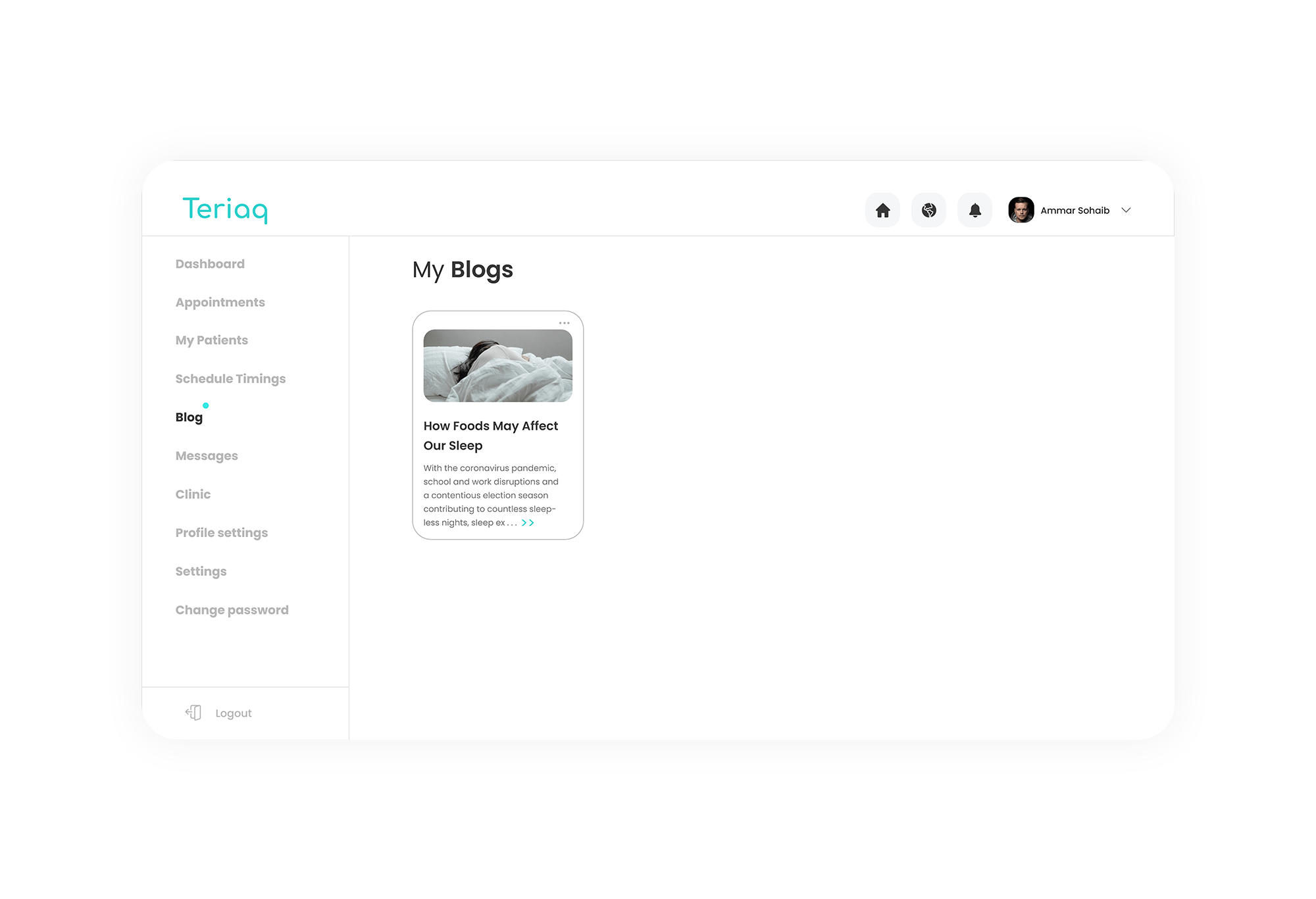
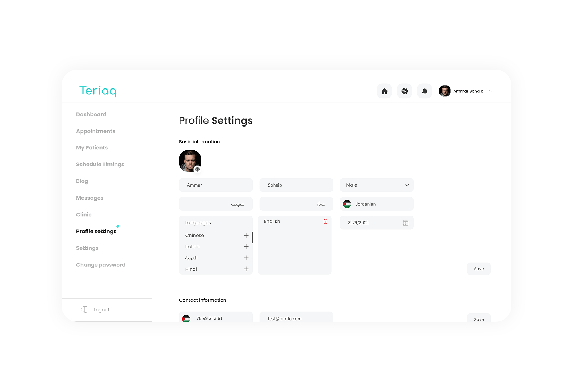
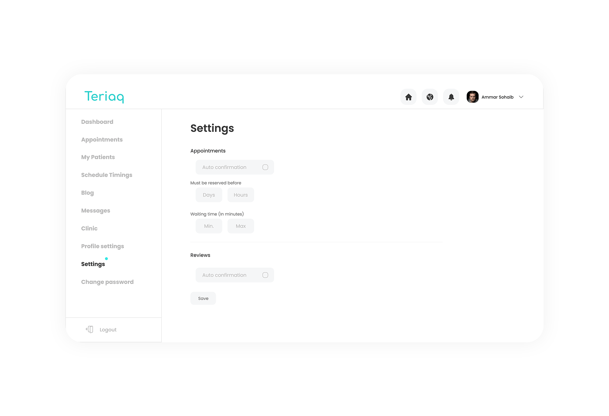
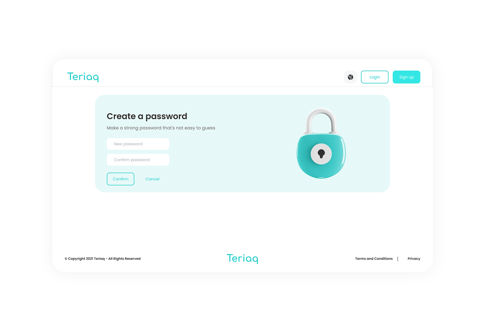
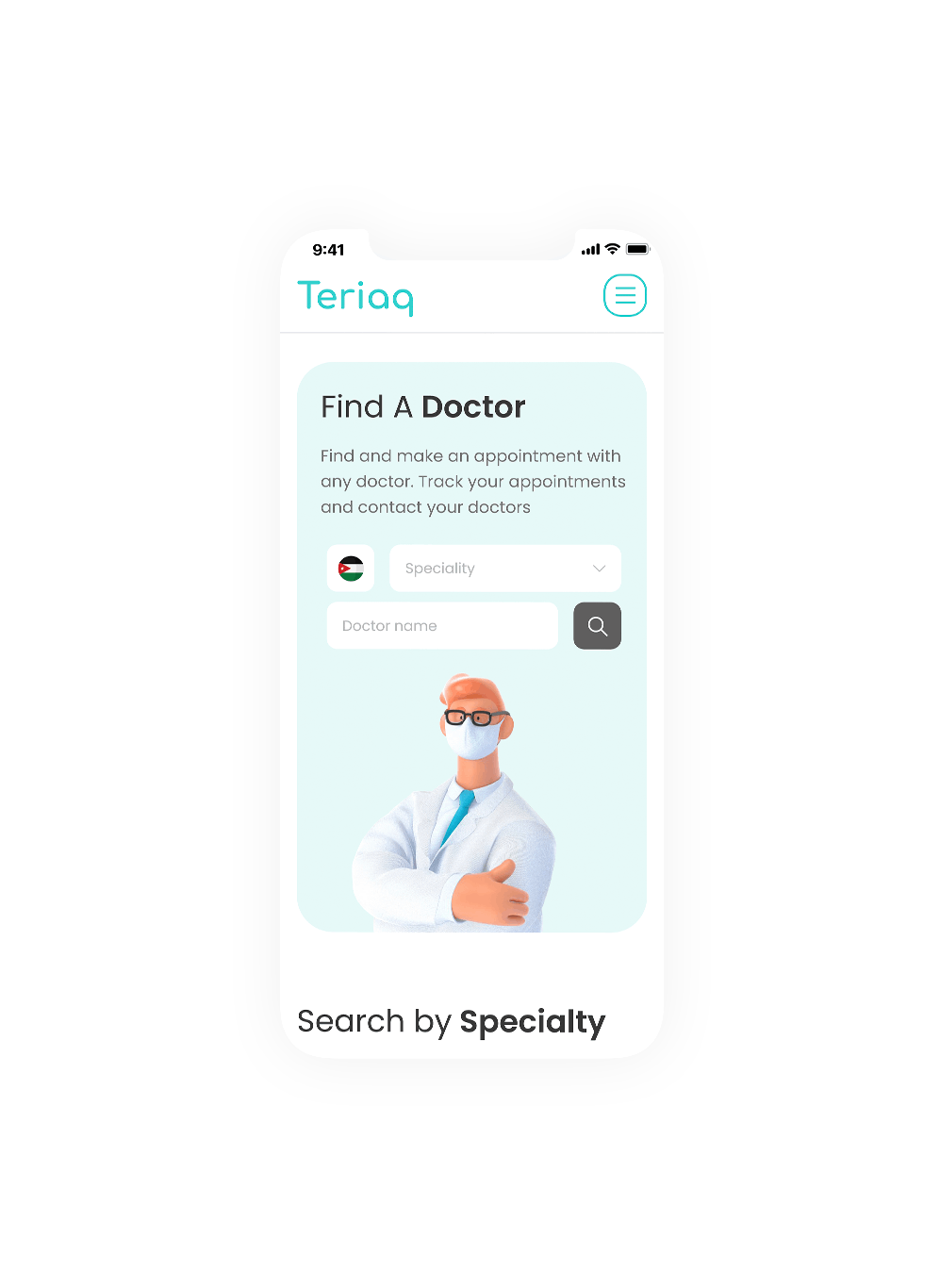
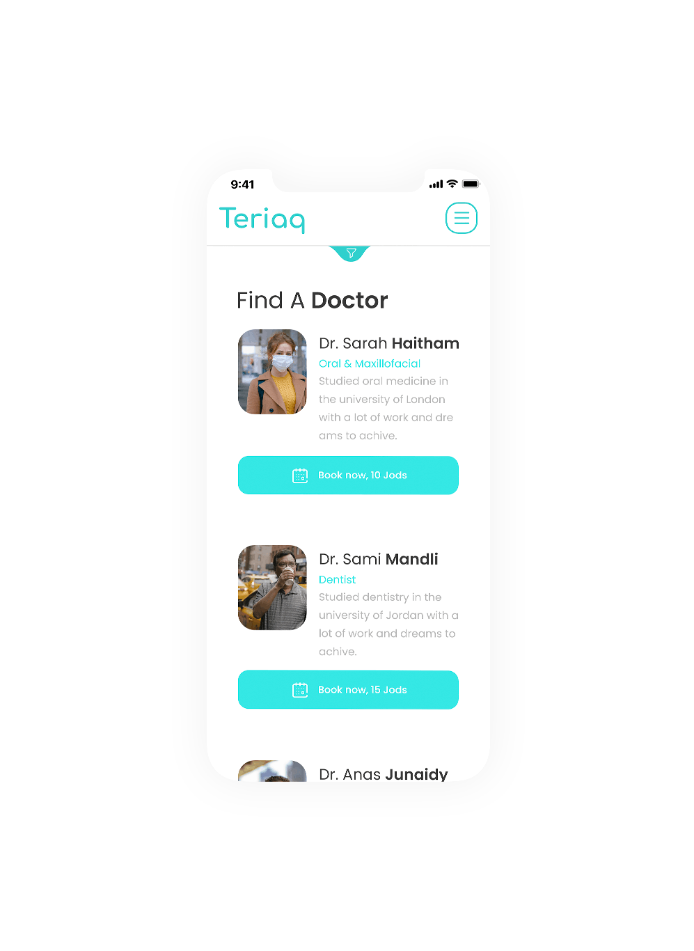
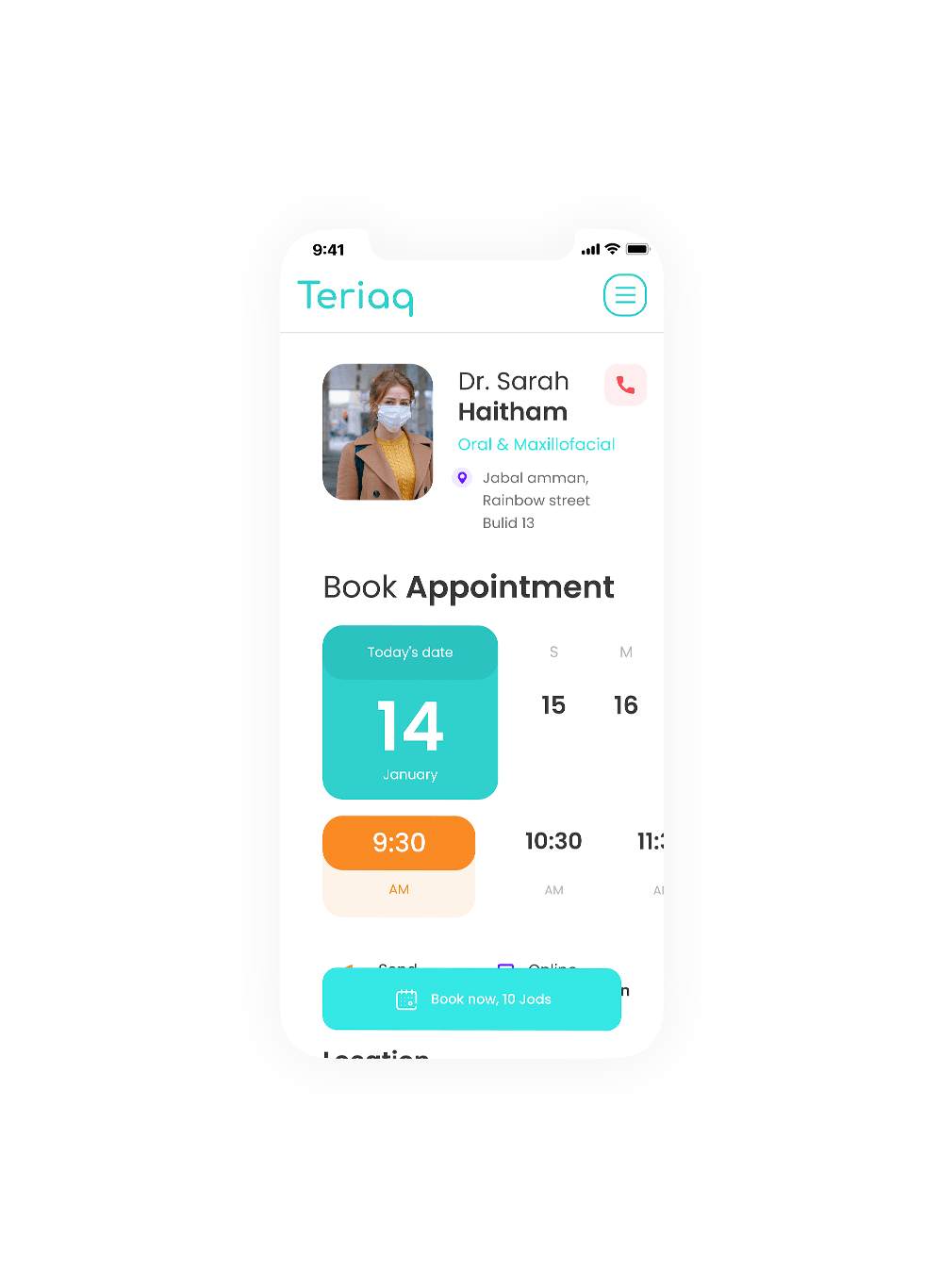
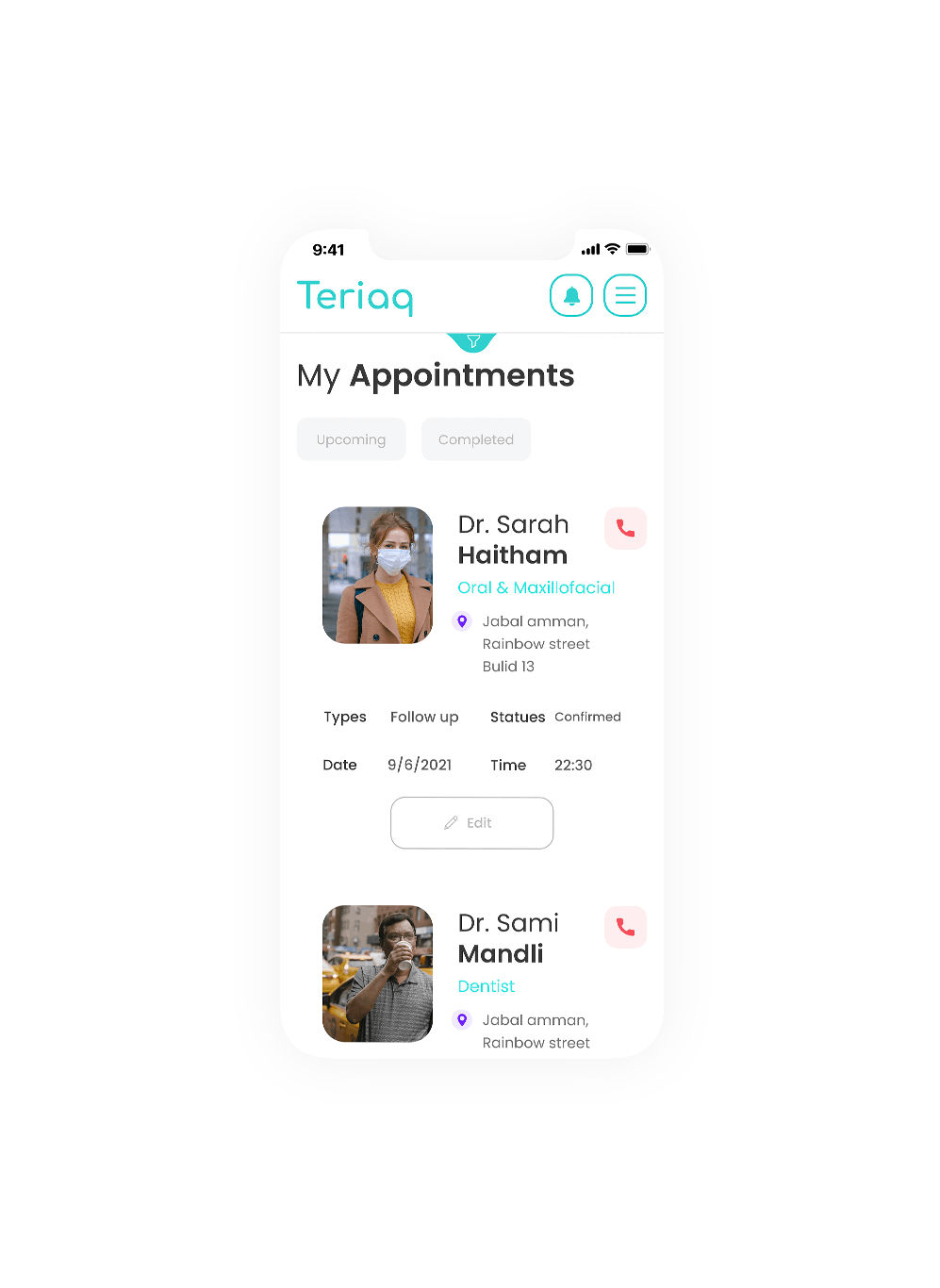
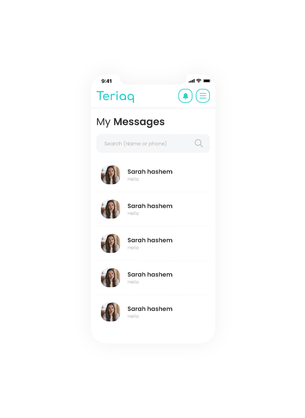
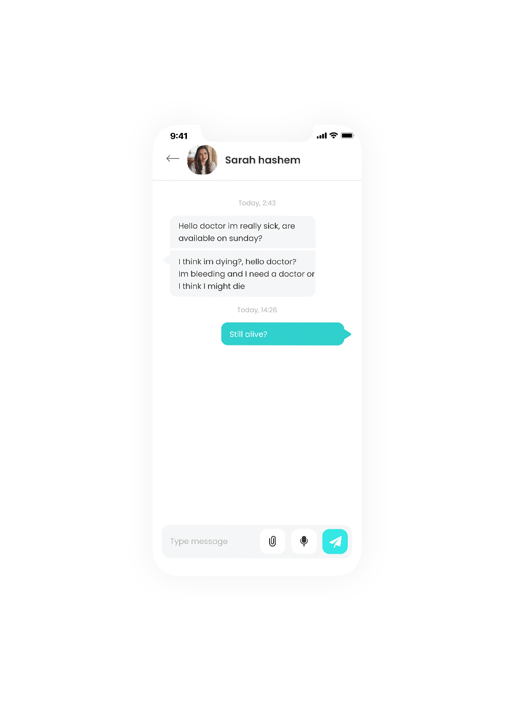
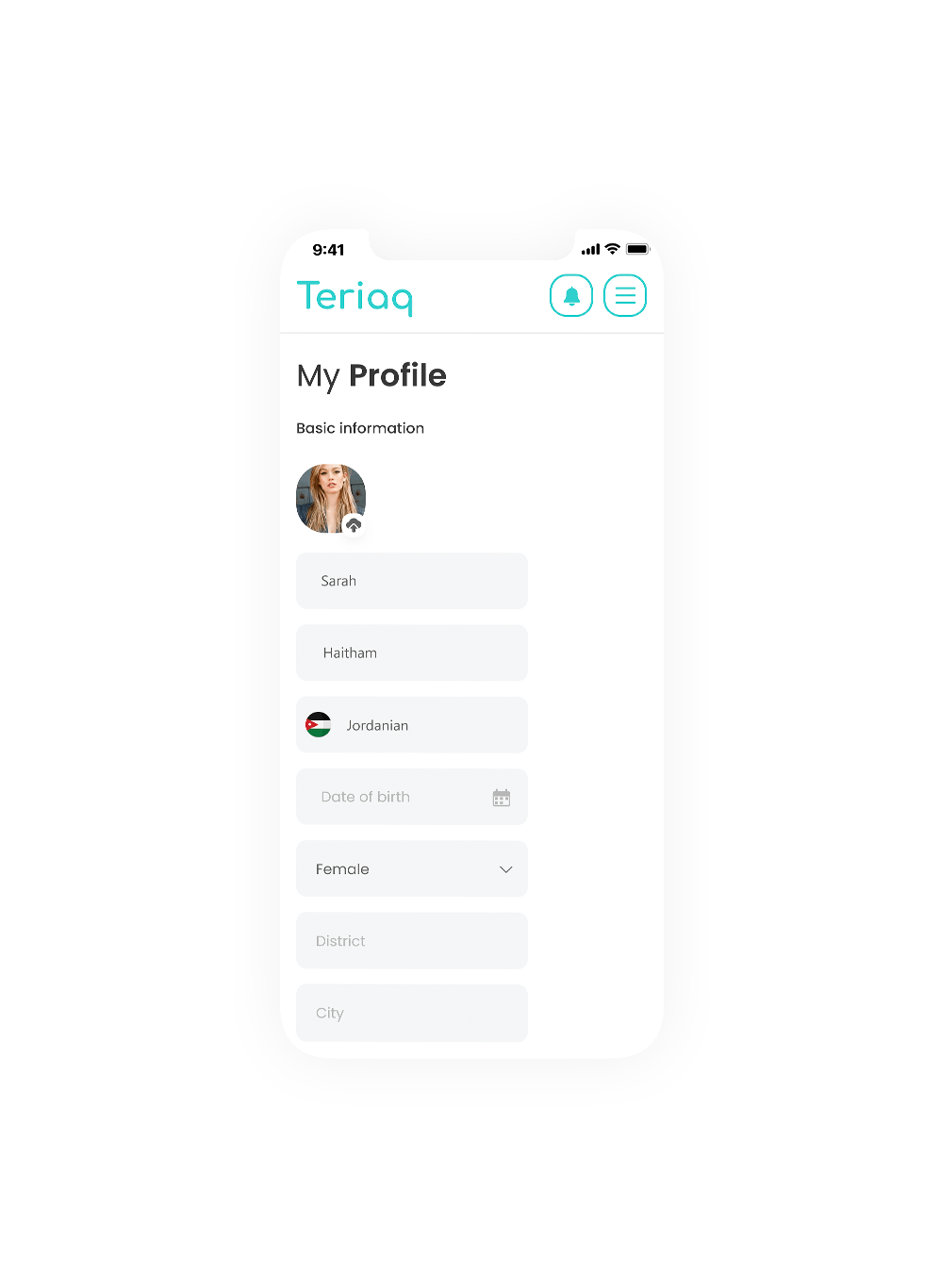
Teriaq have been a real challenge for us, we made every single screen in the desktop view, tablet and mobile! and we made sure our user experience is still at its highest.
Desktop
Mobile
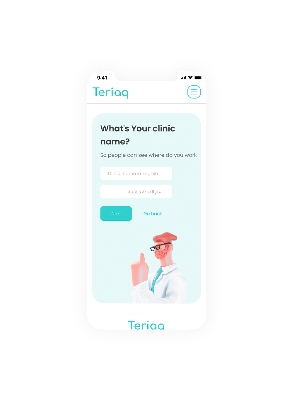
Doctor app
